REKING BABY
REKING BABY brand upgrade
A new brand identity and space guidelines for an early-education center with more than ten years of history, using warm, premium design to soften an academic image and express "love and freedom."
A brand with ten years of history
can't afford to look dated
Founded in 2006, REKING BABY builds on multiple-intelligences research from the FPG Child Development Institute in the US and runs an integrated model of early education, infant care and kindergarten — a strong foundation.
But for today's discerning millennial parents, its brand and spaces looked dated. However international the curriculum, if the center looks like a makeshift neighborhood daycare, young parents won't commit to tuition.
No more cheap cartoons —
turning theory into a feeling of safety
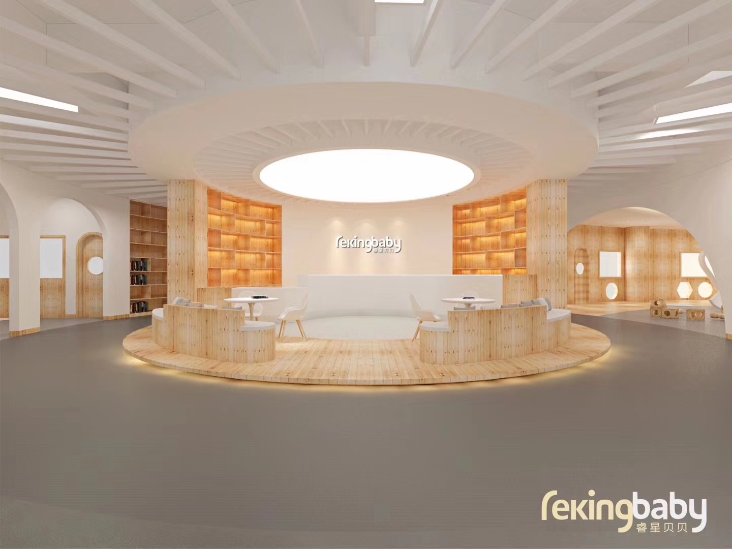
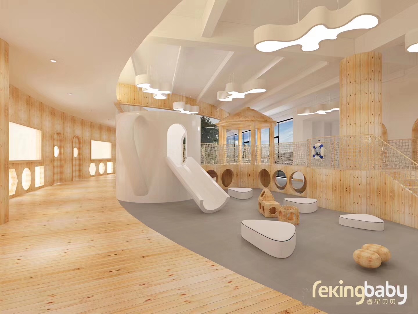
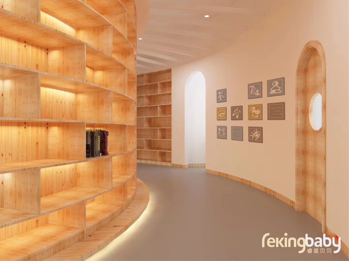
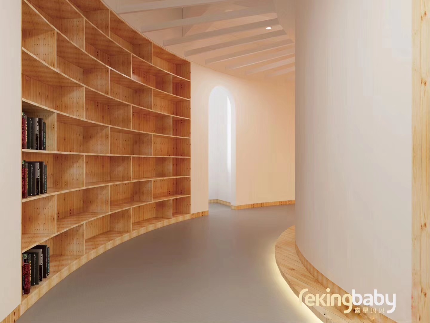
We dropped the busy, cheap cartoon graphics. A gentle, bright palette and orderly space guidelines turn the brand's promise of "love and freedom" into a premium environment you can see.
That restrained, professional design language turns dry academic credentials into a sense of safety parents feel the moment they walk in, raising same-day enrollment on visits.
From design to delivery
Three core stagesFor an integrated business spanning infant care, early education and kindergarten across five programs, we restructured the brand architecture around "professional and inclusive," keeping one tone across every line of business.
Moving past a childish look, we rebuilt the logo from geometric forms with an international education feel, with a palette of warm yellow and soothing blue-green that replaces institutional heaviness with health and joy.
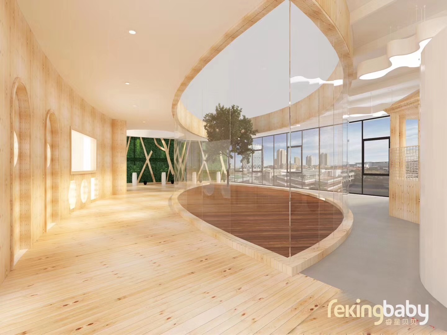
Education brands are judged by their spaces. We carried the guidelines into signage, interior wayfinding, learning materials and parent handbooks, so the environment itself becomes the most persuasive brochure.
A premium environment delivered
high conversion on visits
With a premium identity that matches its decade of expertise, REKING BABY shed its dated image. A professional, warm space removes the trust barrier for a new generation of parents.
"We've run early education for over ten years and our curriculum is among the best, but we always lost out by not looking premium enough. LGX reshaped not just our logo but the feel of the whole learning environment. Now when young parents walk in, the professional atmosphere of 'love and freedom' reassures them right away, and enrollment conversations are much easier."
— Director, REKING BABY Education Group01 · Brand & spatial design
Teaspa
Full branding for a spa chain