
Selected work
Selected
Works
Every project is a real partnership —
from strategy to execution, concept to delivery.
Here is some of the work we are proud of.
12
case studies
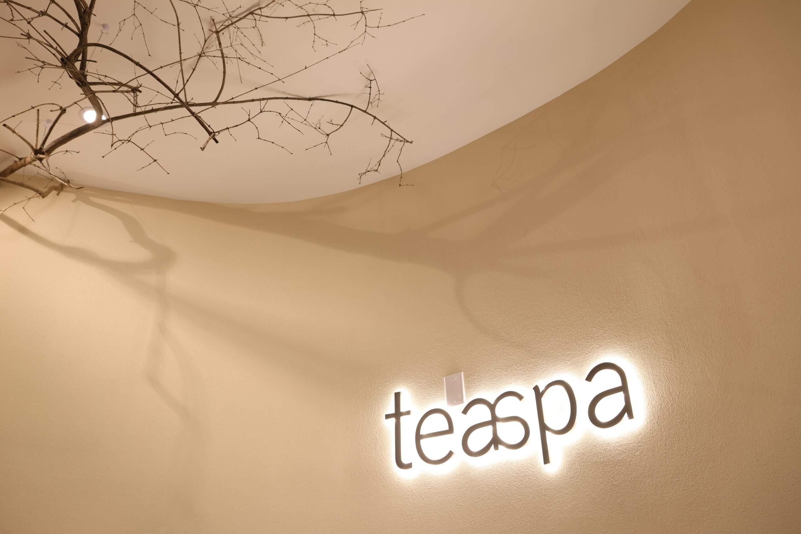
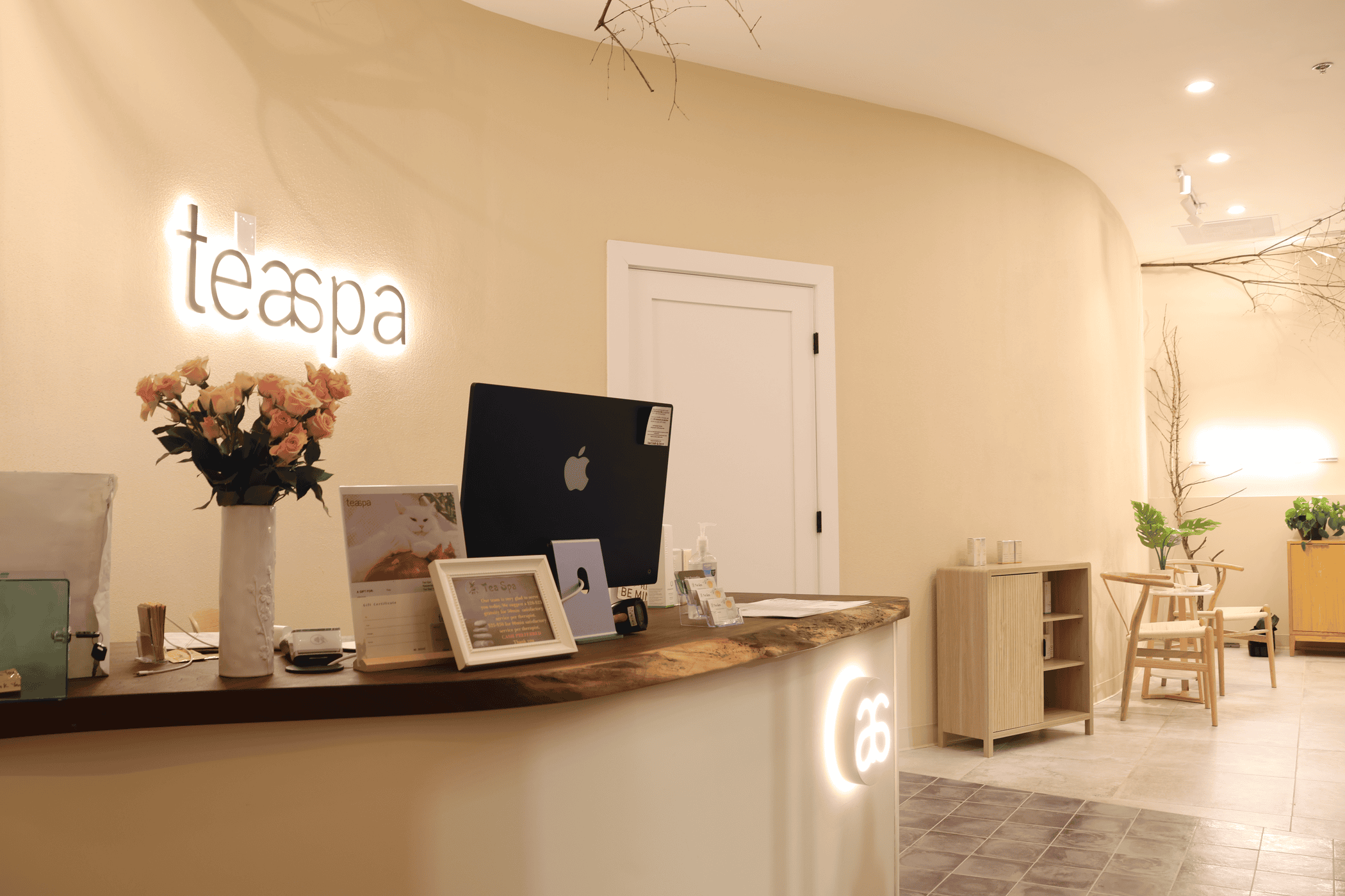
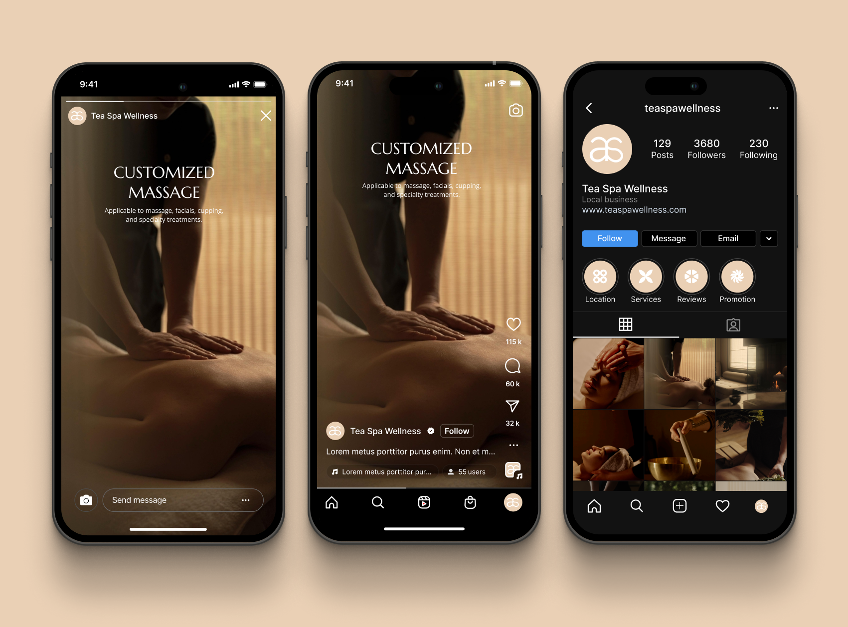
A complete brand identity, built from zero, for Teaspa, a Maryland massage and spa chain. The design language draws on nature and the restraint of Eastern negative space, with guidelines that extend across every medium.
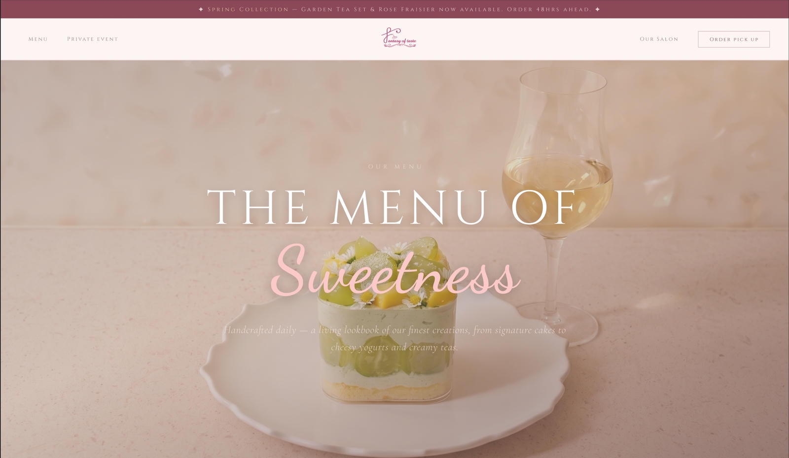
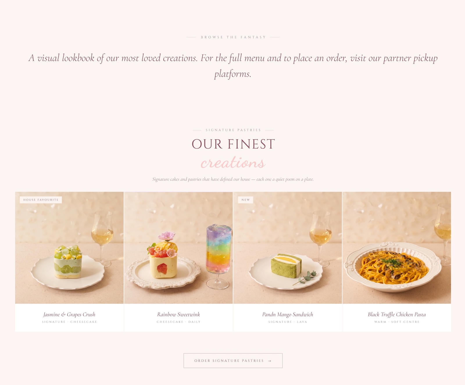
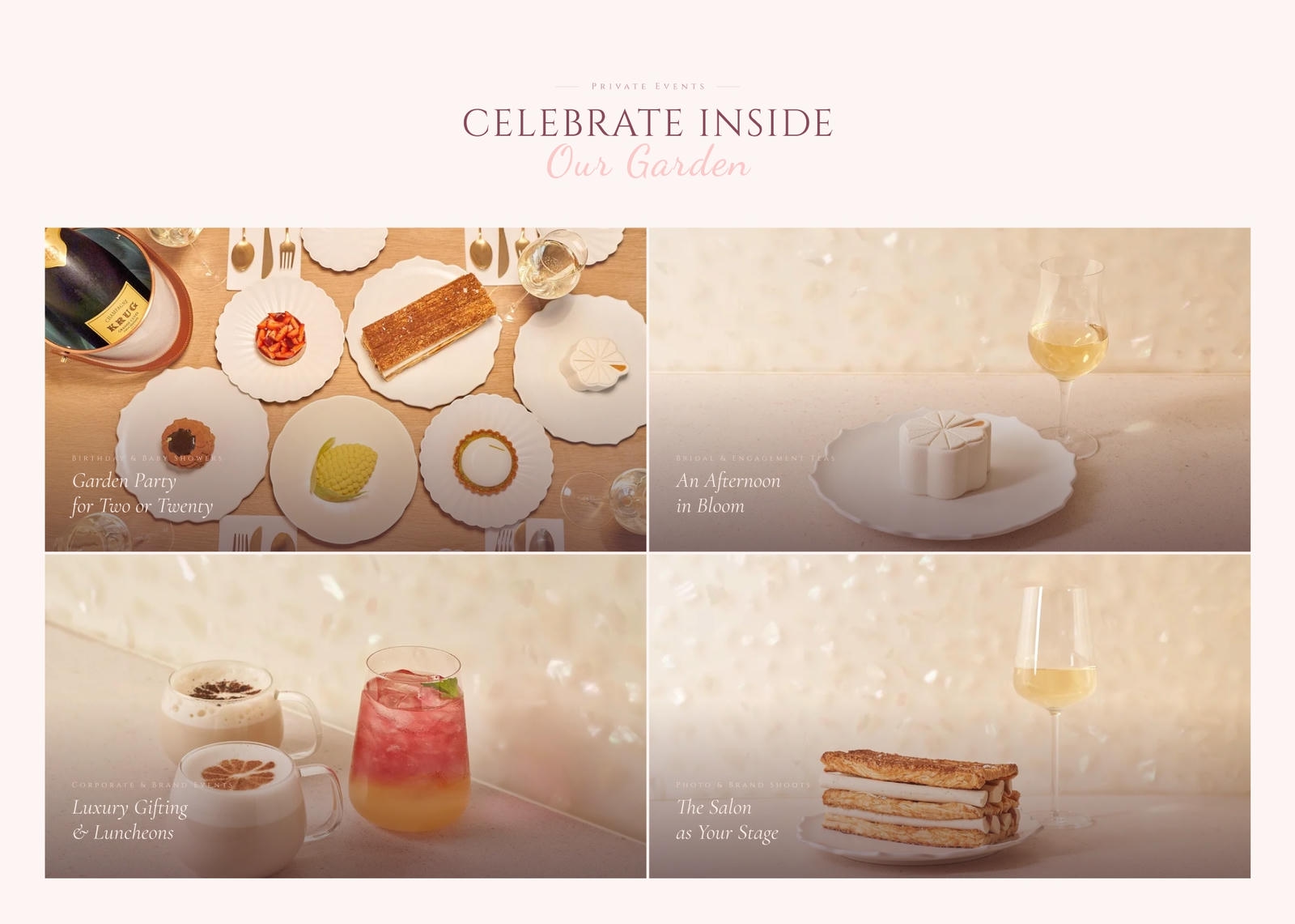
The patisserie's in-store prices were premium, but its online presence was too thin to justify them — customers couldn't feel the quality through the screen. Instead of flashy effects, the redesign leans on high-resolution imagery and generous white space. A minimal visual framework and a smooth online ordering flow shortened the path to purchase: it looks premium, and it's easy to buy.
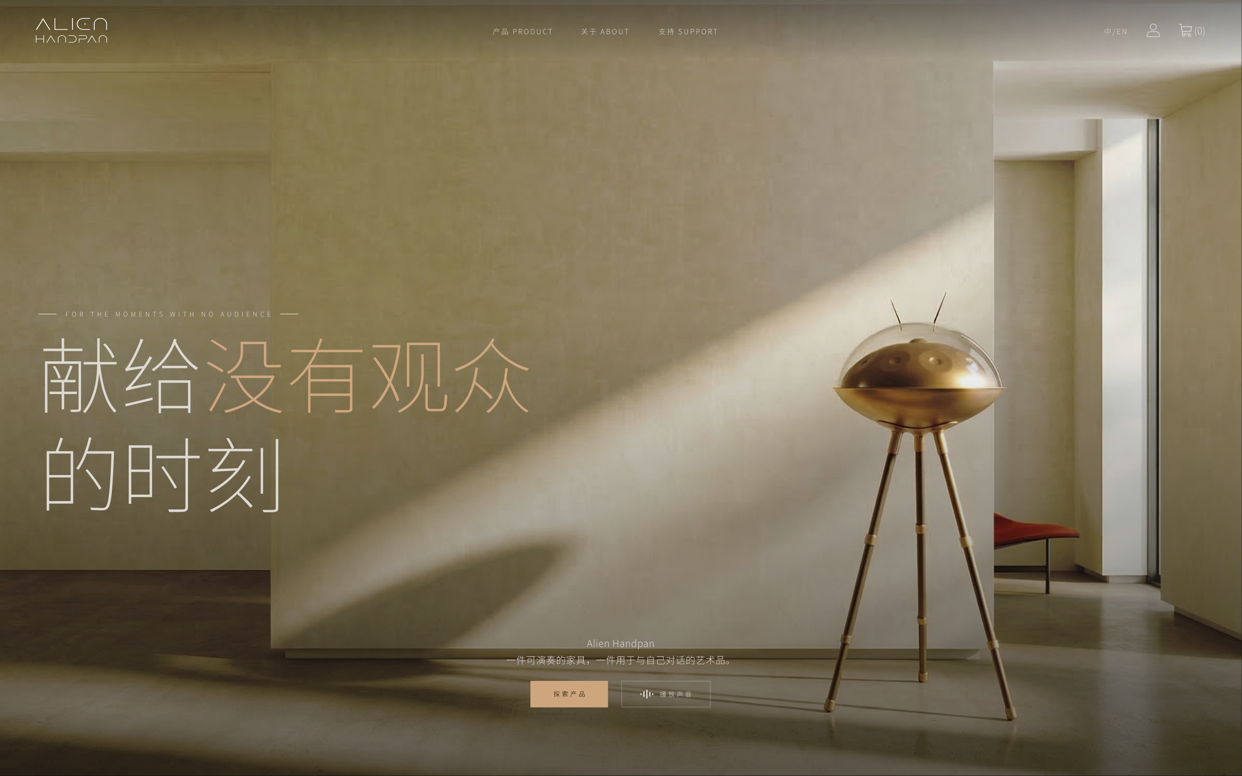
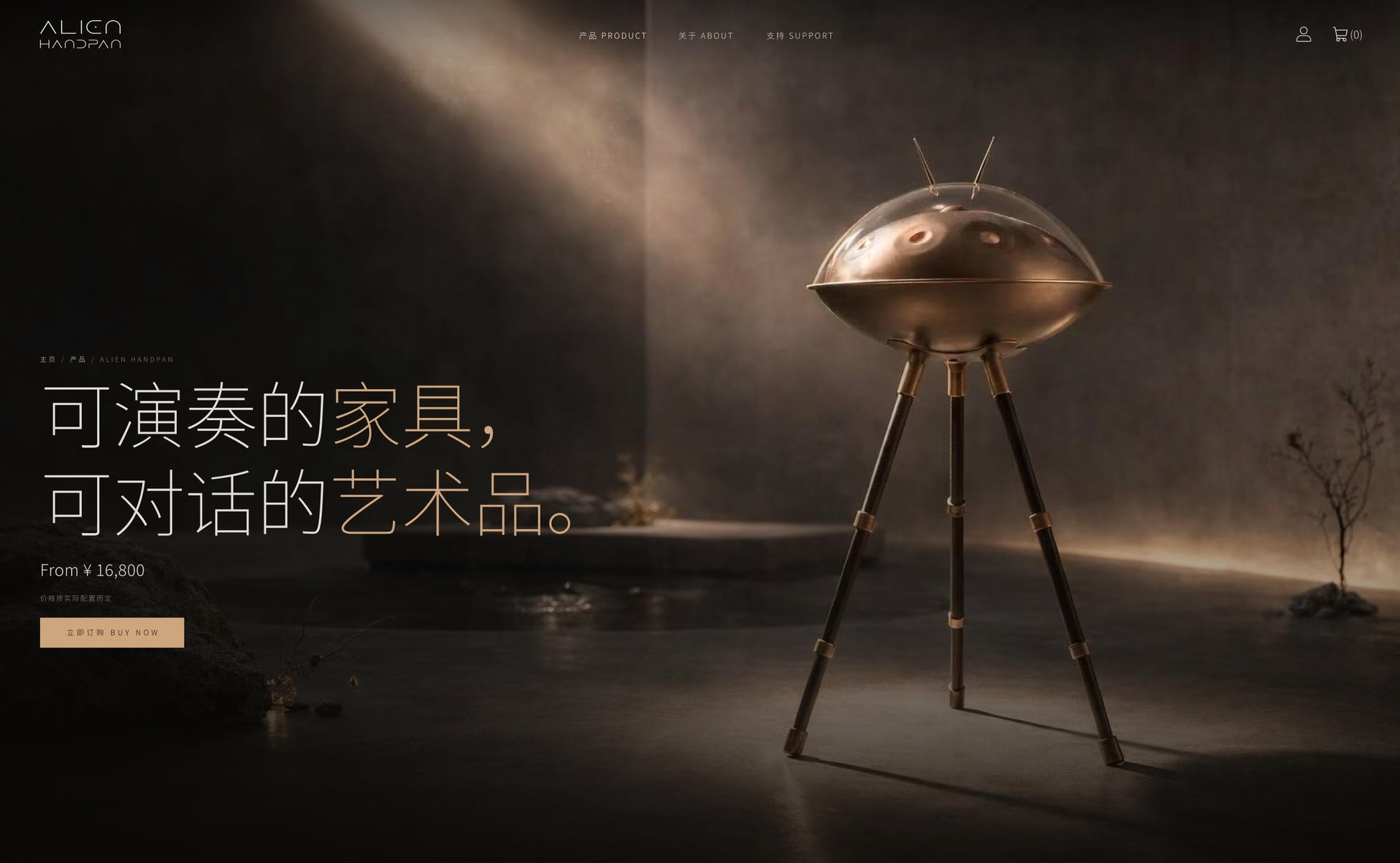
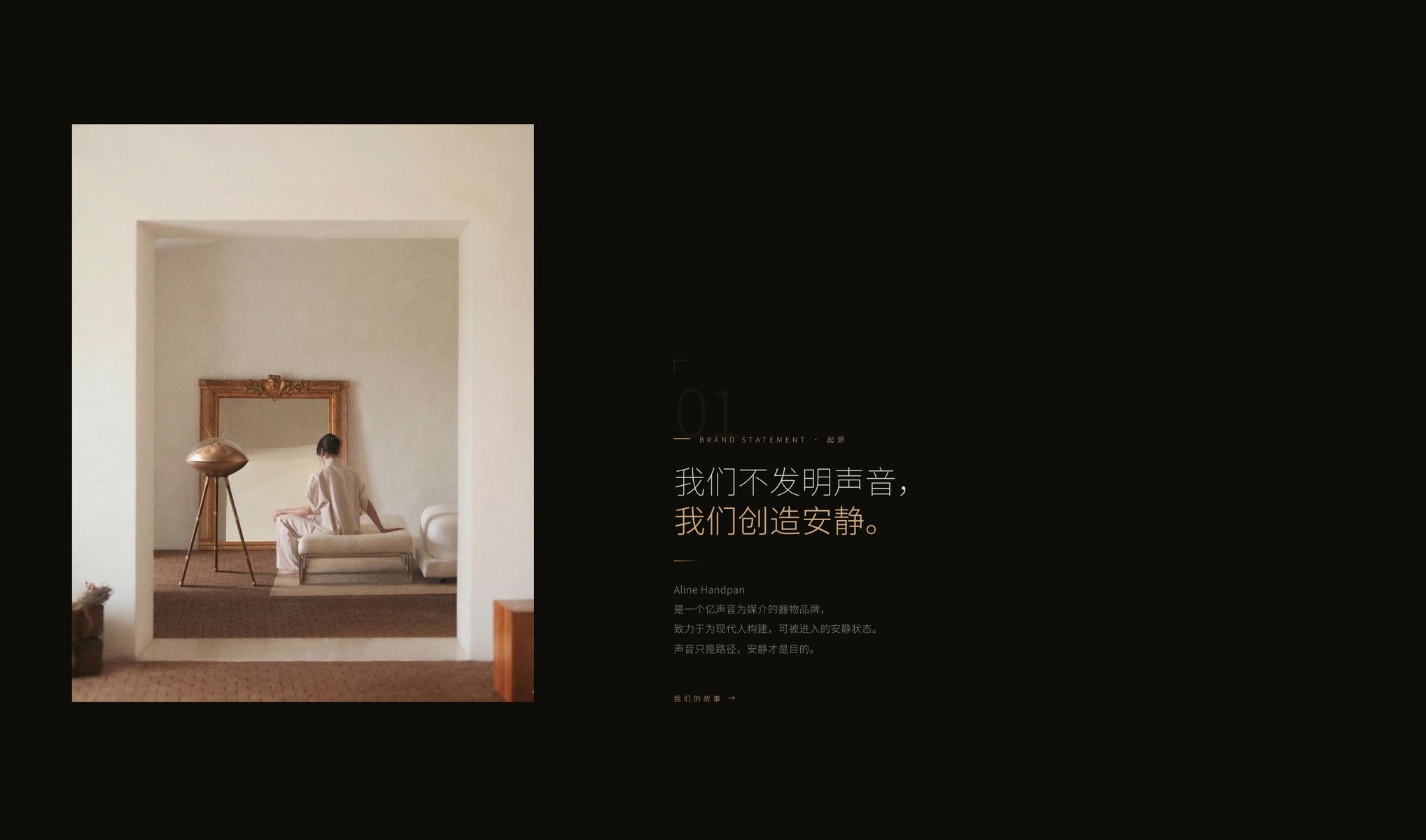
The handpan is a niche instrument people need to experience — a product catalog alone won't sell it. We built immersive audio-visual interactions into the site: hover over an instrument and hear it ring. Dark visuals paired with live sound bring out its mystique, letting visitors experience the instrument up front and turning a long consideration cycle into a confident purchase.
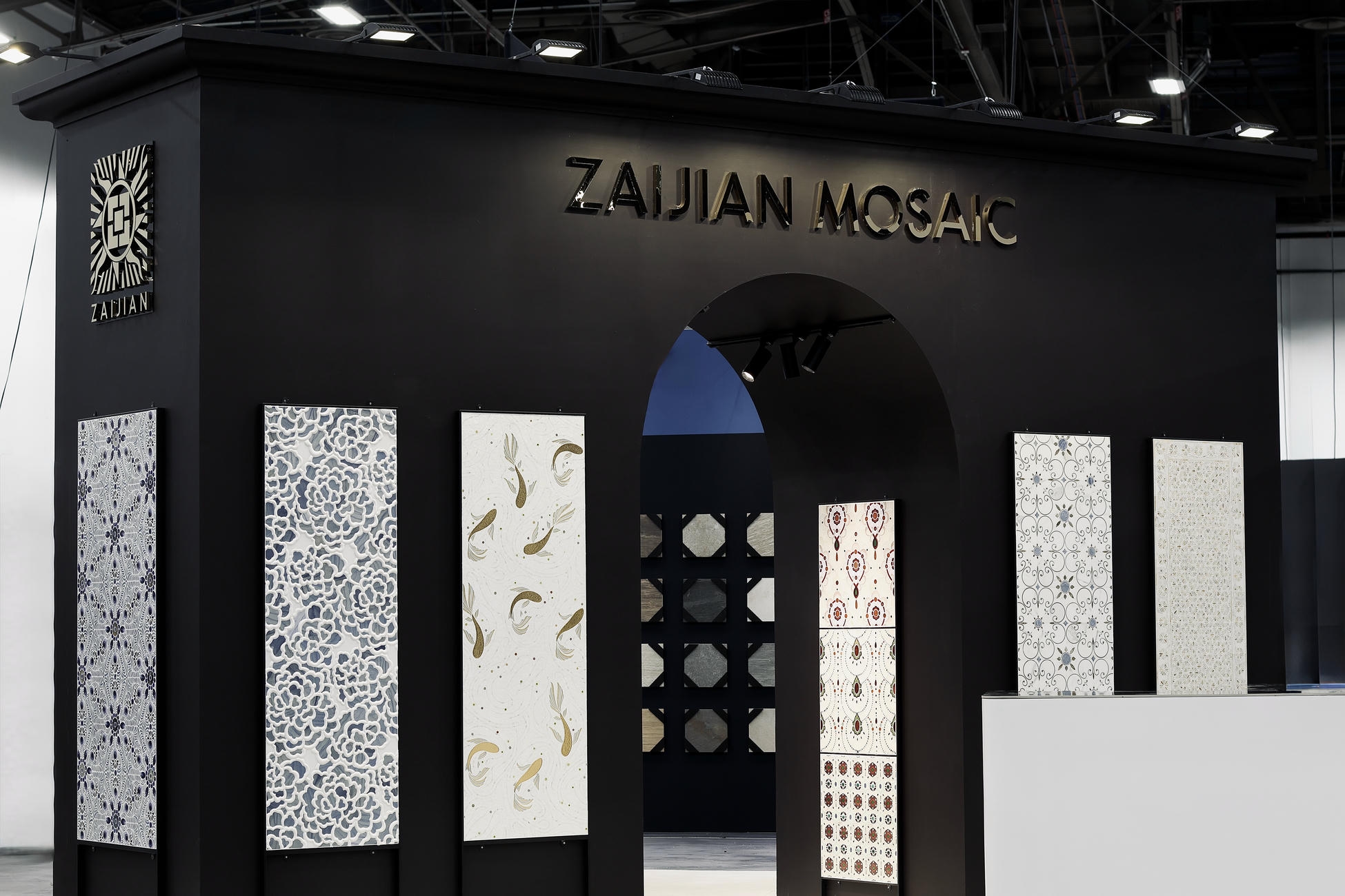
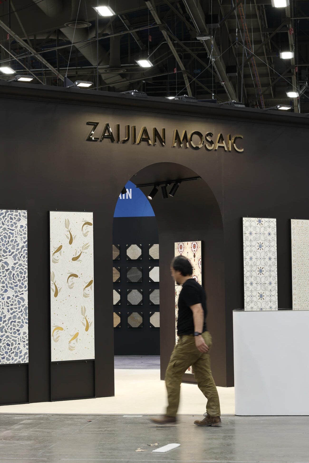
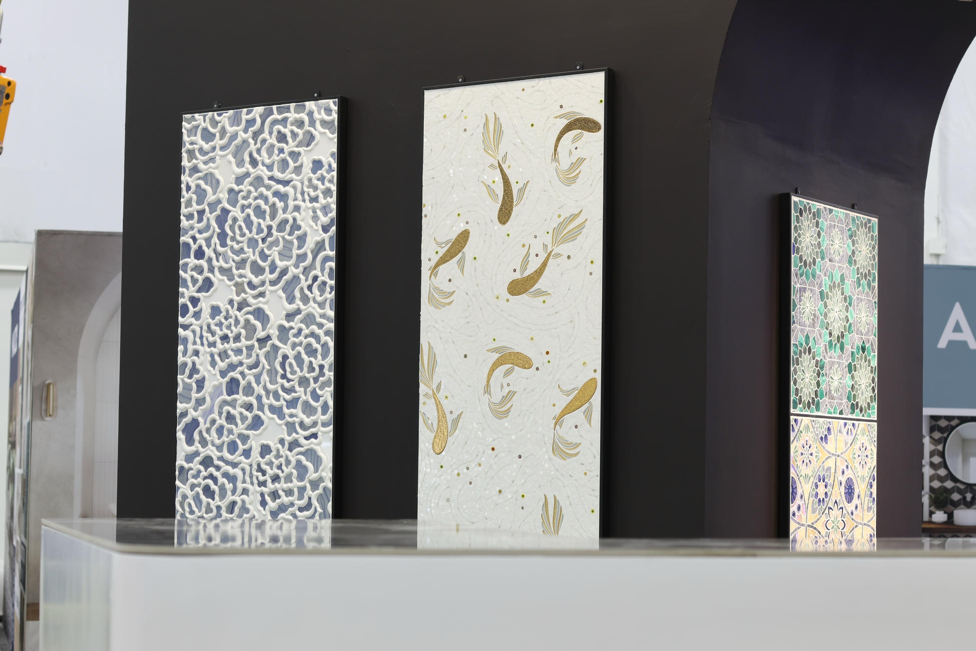
At a major trade show, the biggest risk is becoming forgettable background. ZAIJIAN MOSAIC's brief was direct: stop traffic and capture leads. A booth has to hold people, not just look good. We simplified the spatial story and made a large-scale mosaic the undisputed focal point, making complex craftsmanship instantly visible. That on-the-floor impact, combined with a clear visitor flow, drove booth visits and qualified inquiries.
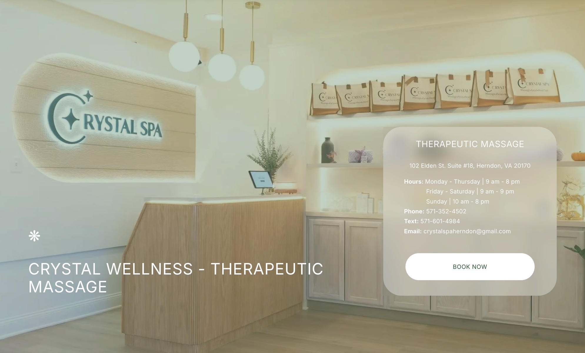
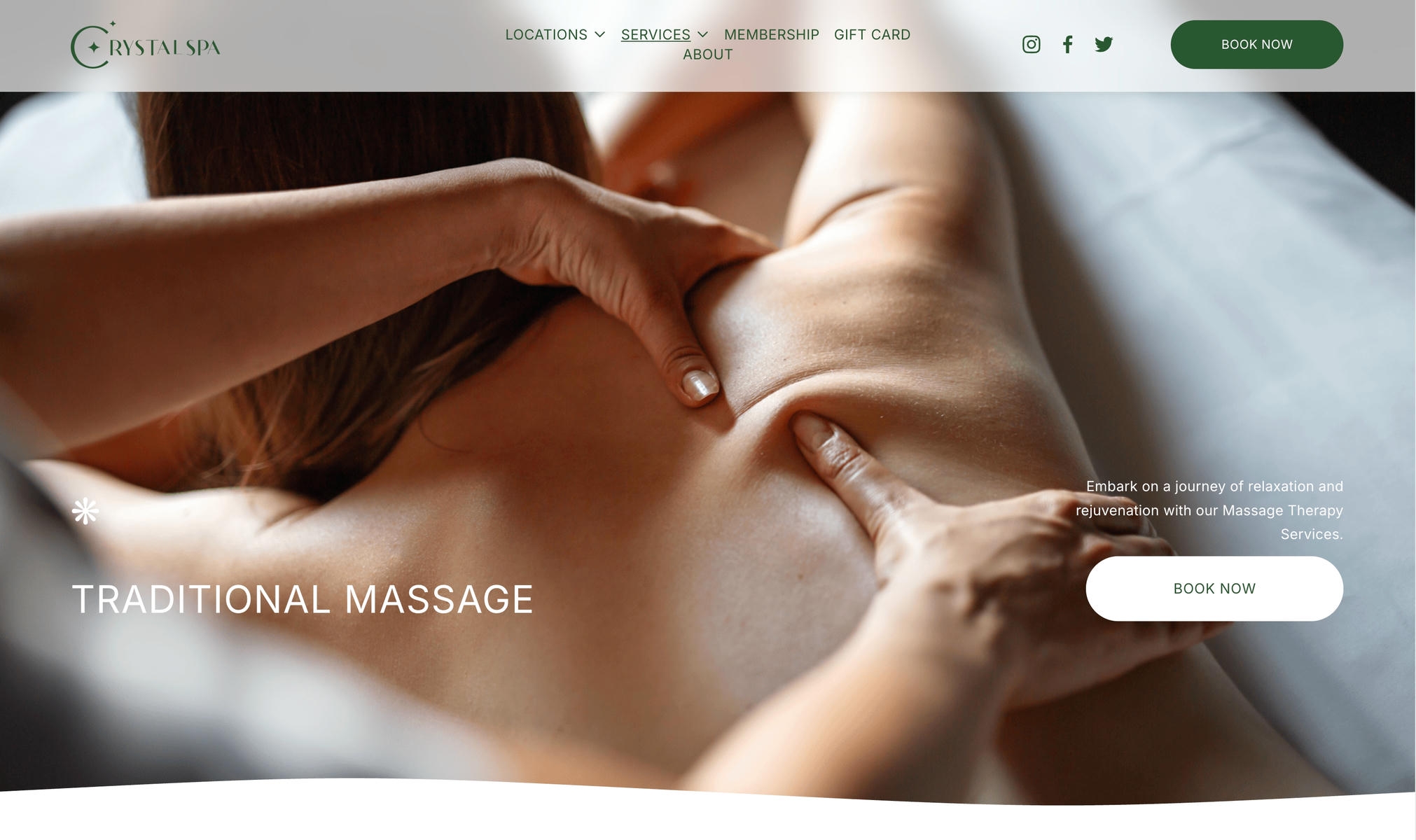
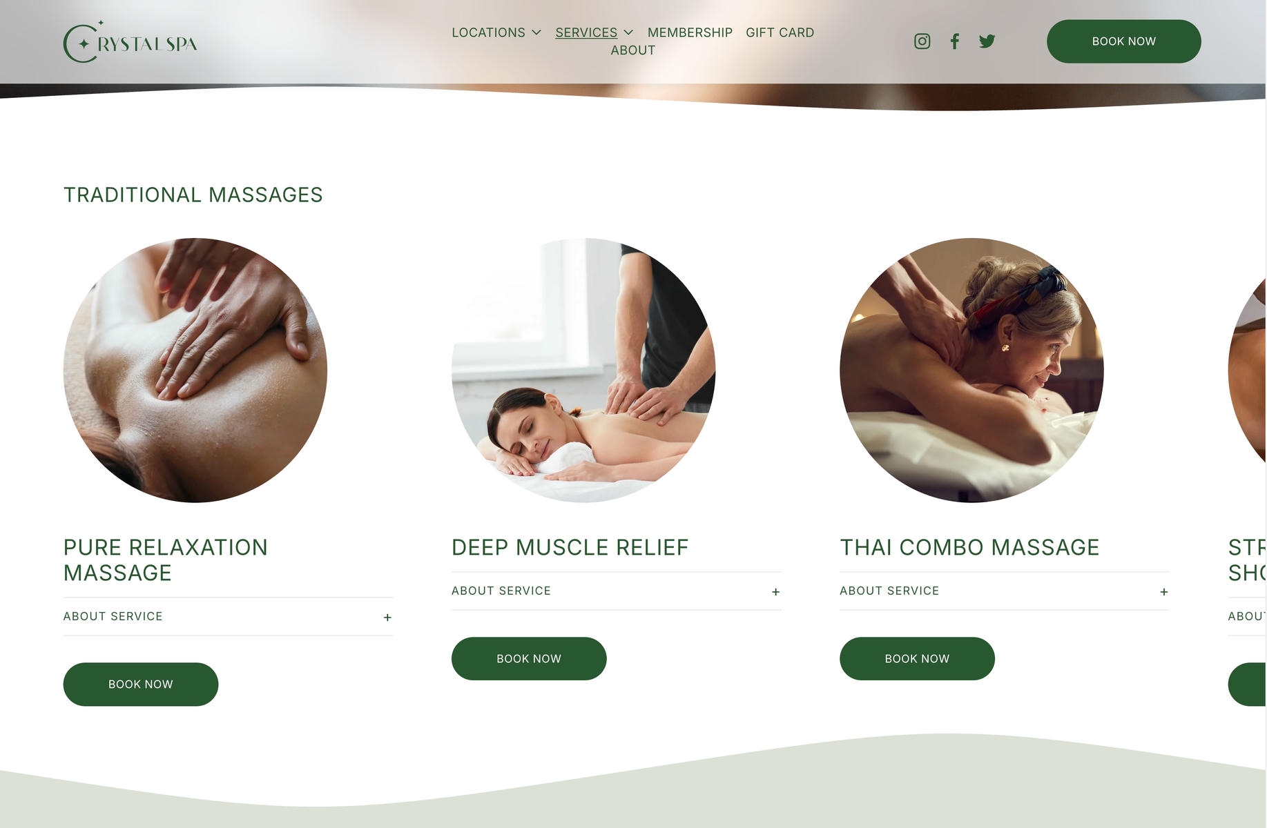
For a service business, a website has two jobs: build trust and make booking easy. This Virginia spa's old site was dated and its booking flow kept breaking — guests were frustrated before they ever arrived. We used calming earth tones and smooth micro-animations so the site feels relaxing at first glance. That reassuring visual language, plus one-tap booking, turned the website into a 24/7 front desk.
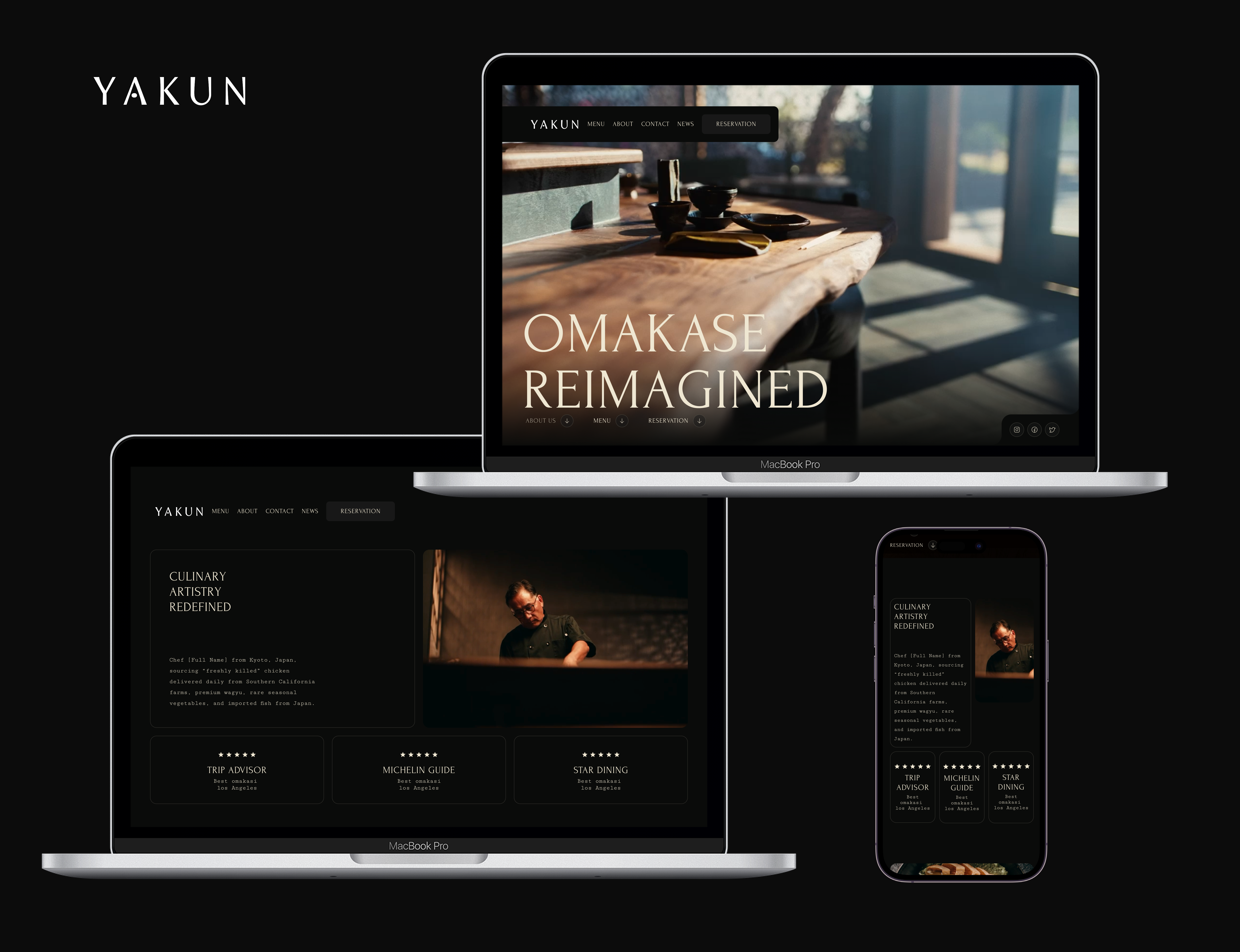
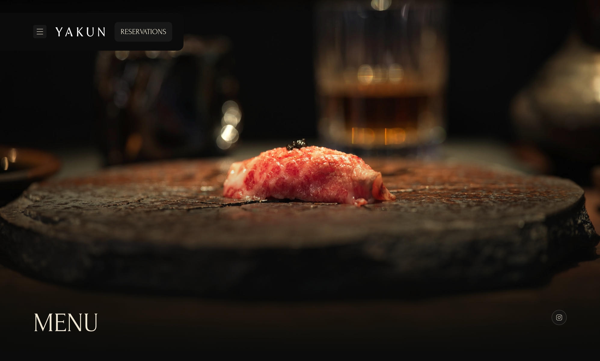
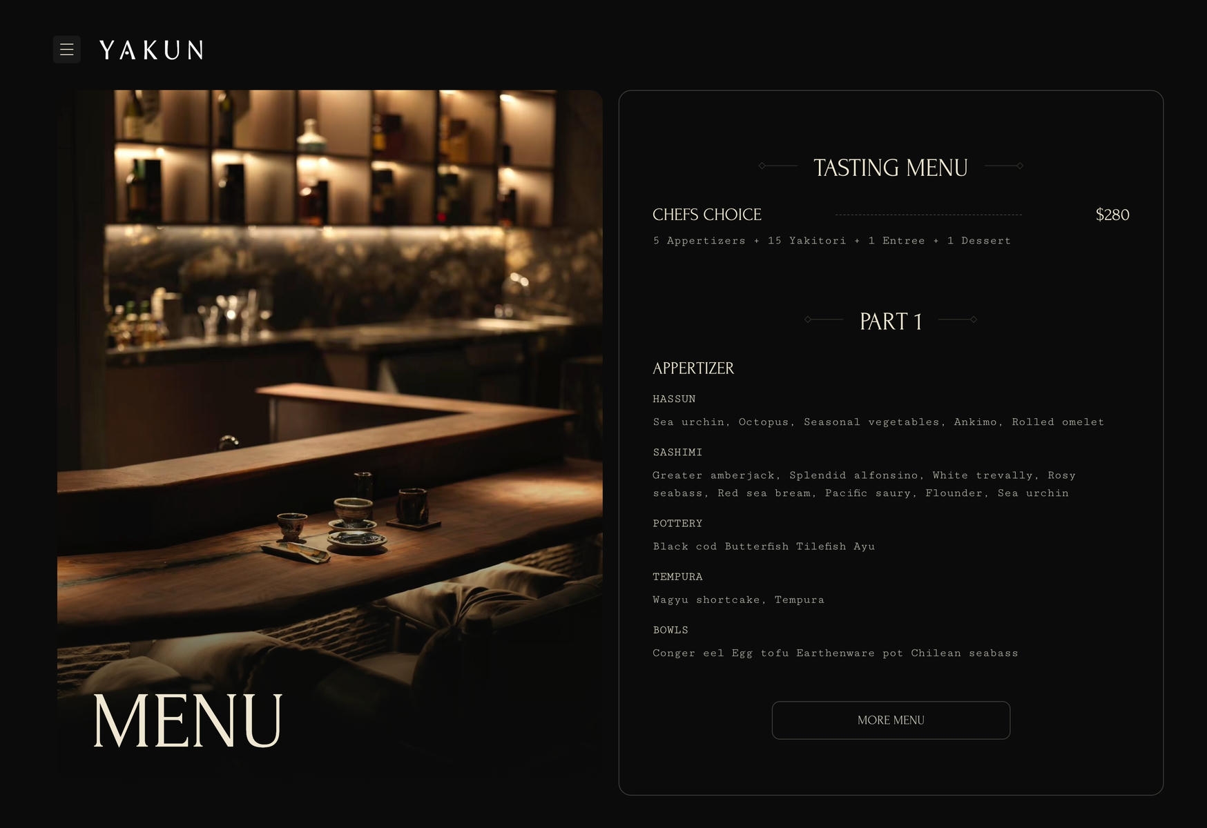
A Michelin-recognized restaurant isn't short on reputation — it needs a digital experience that matches it. YAKUN wanted its website to convey the ritual of fine dining and make every meal feel worth it. We borrowed from high-end editorial layouts, removed every distraction and put the craft of each dish and the chef's philosophy front and center. That restrained, premium presentation converts high-value guests into reservations.
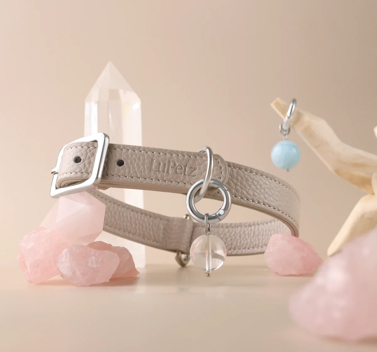
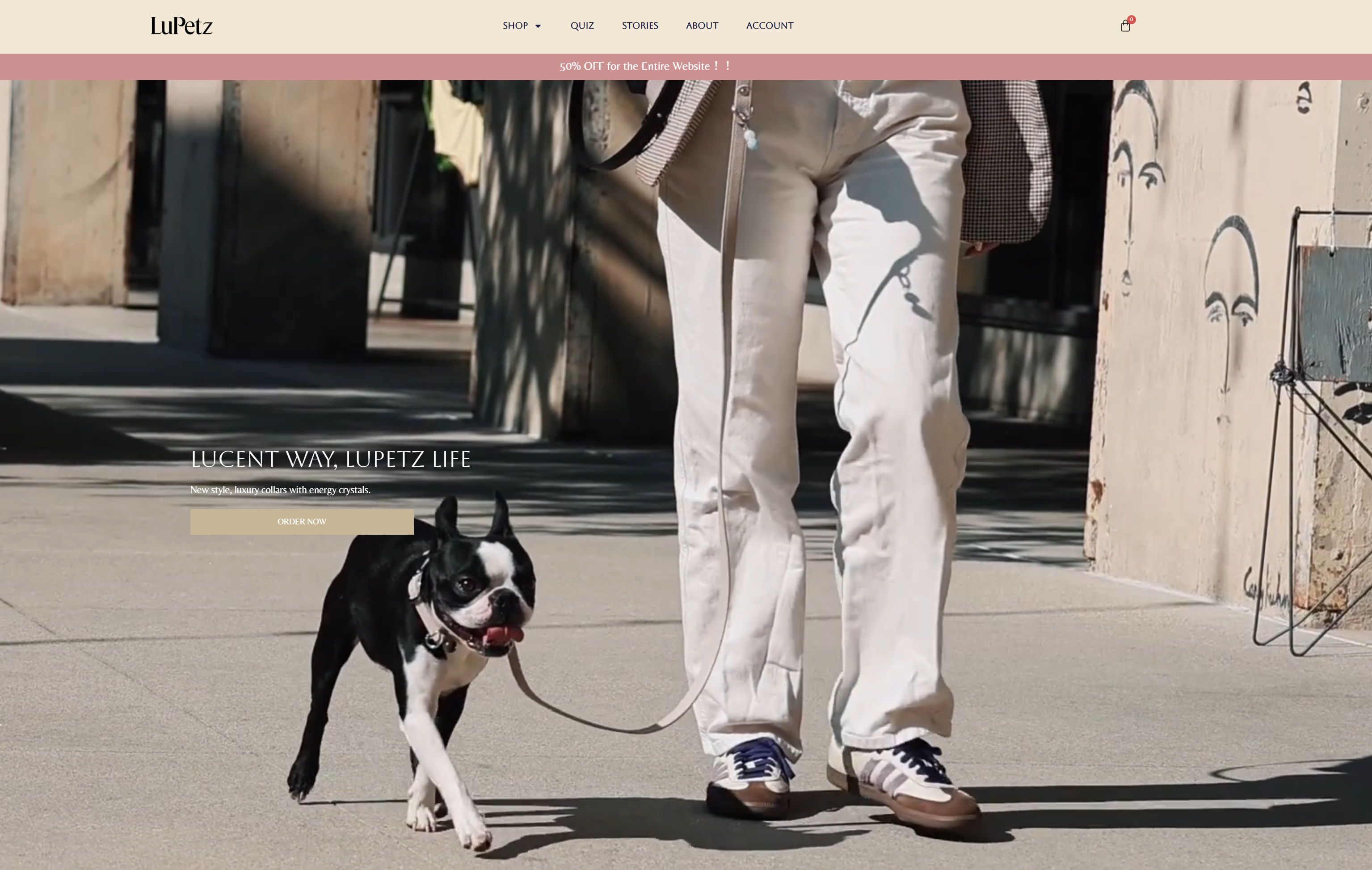
For a pet brand entering the US, the hardest part is bridging the cultural gap and earning trust fast — why would anyone buy from a brand they've never heard of? From the identity stage we spoke the language of Western pet culture, using lively, highly recognizable visuals to connect with customers directly. That likable brand tone, paired with targeted social media marketing, cleared the first hurdle of the launch at a very low acquisition cost.
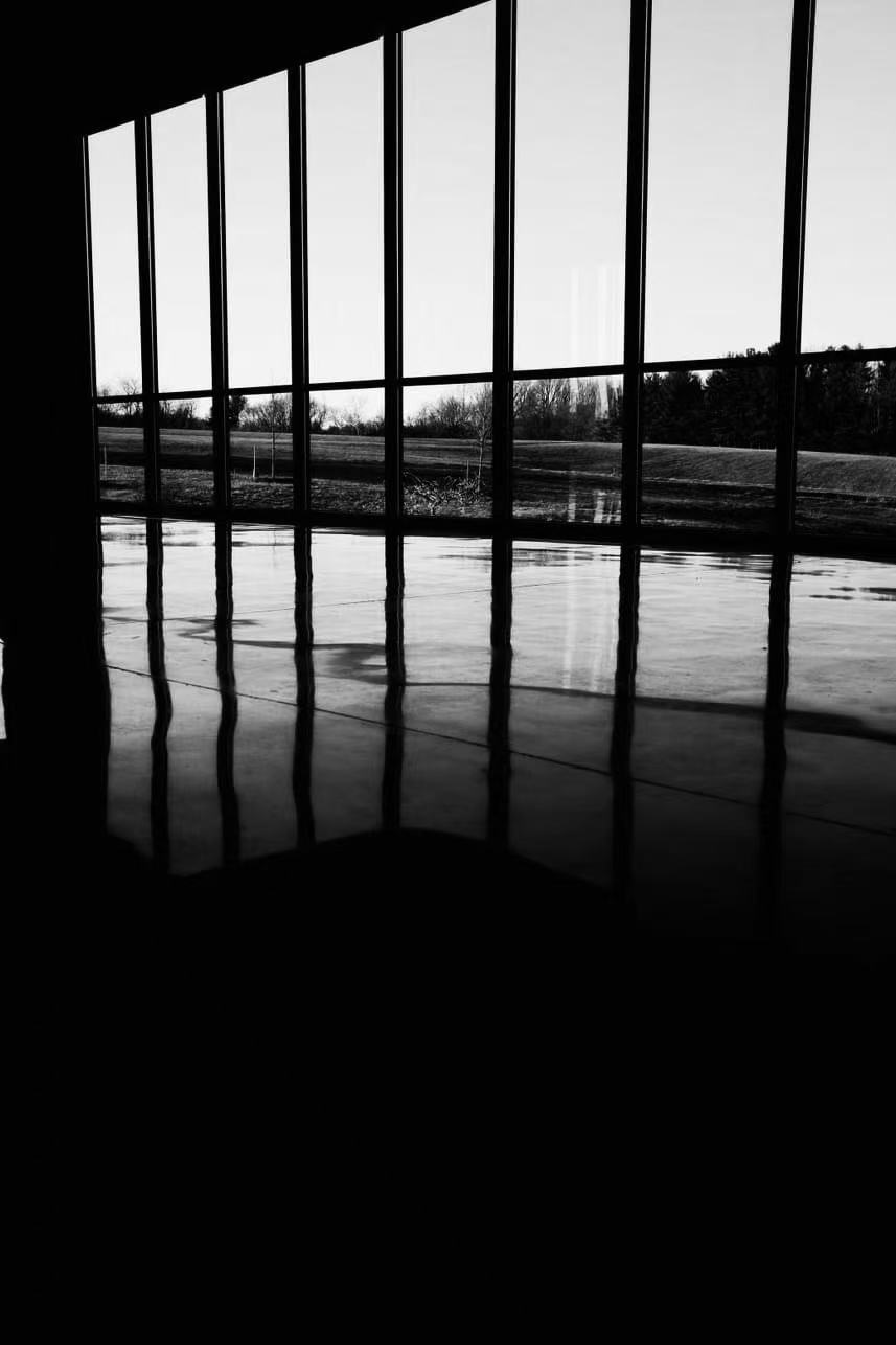
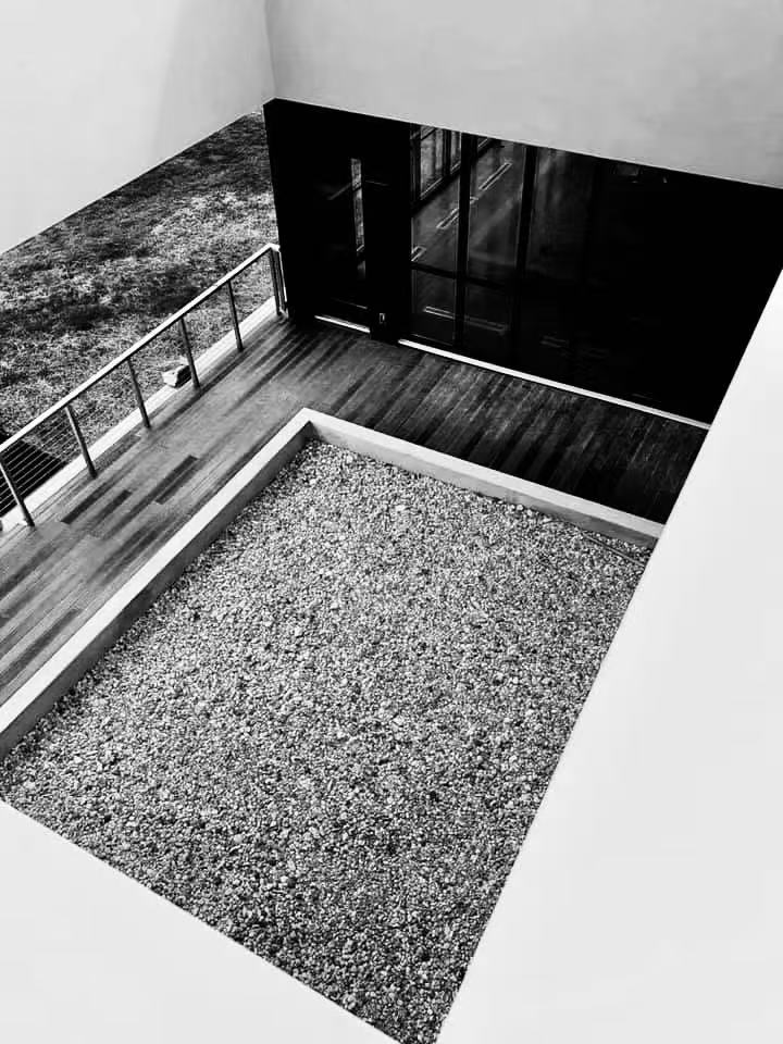
Meditation is an abstract offering. How do you turn words like "stillness" and "awareness" into a visual language that brings in members? It has to feel grounded, not vague. AMATA's refresh is built on light, shadow and natural textures. These restrained, warm guidelines remove the distance newcomers feel, let people sense the atmosphere of the center online, and lifted sign-ups for intro classes.
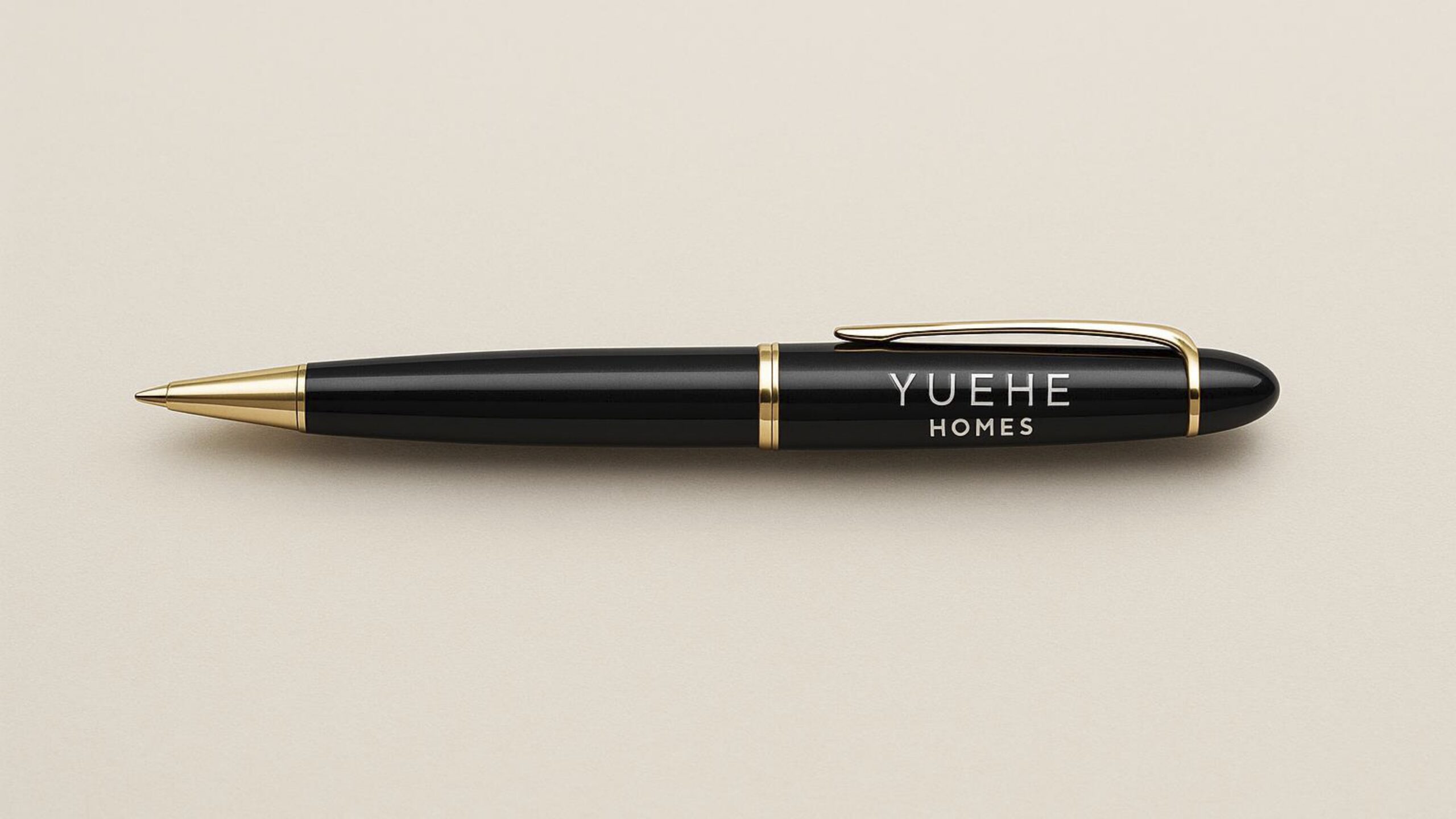
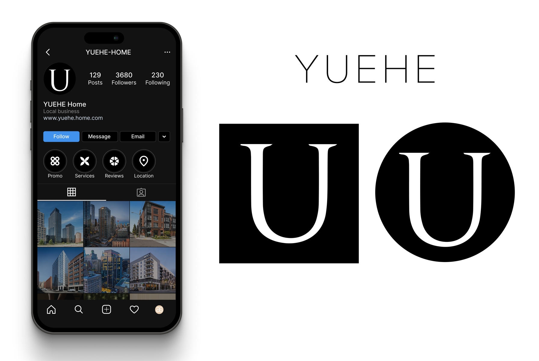
Maryland's local real estate market is fiercely competitive, and YUEHE's old image looked thin and makeshift. For a transaction as big as buying a home, why would clients trust you? We moved the brand toward the professionalism of financial and advisory firms and dropped the cliché house icons. A professional, trustworthy identity, combined with targeted local digital ads, quickly improved agents' lead generation and closing rates.

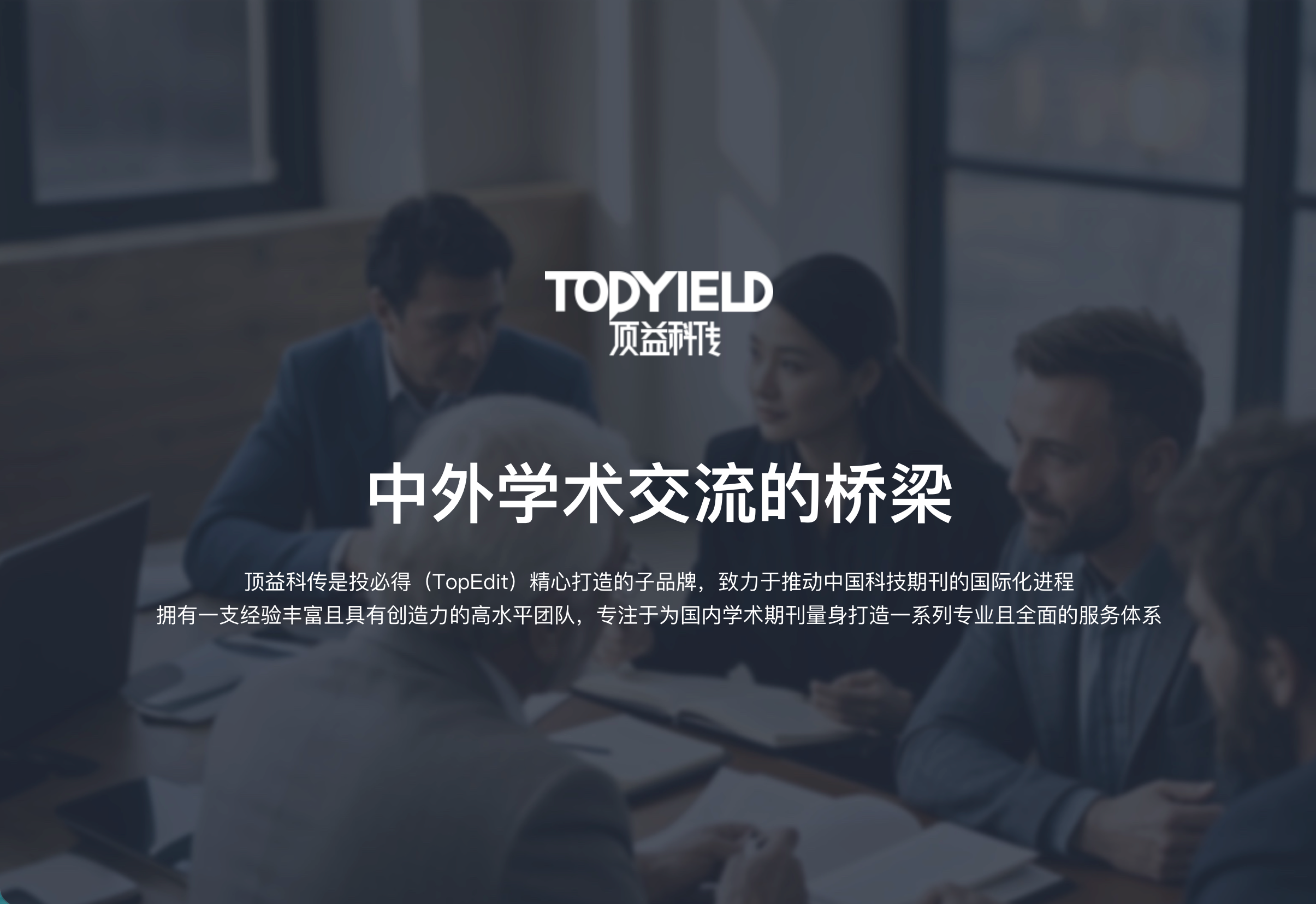
Strong academic credibility for a leading SCI manuscript editing company and its journal sub-brand. We dropped the decoration and used the rigor of international journals to build trust in academia: a new identity system with industrial order and strength, standardized from business cards to business plans. These high-caliber pitch materials raised the company's standing in negotiations and gave it the edge in competitive bids.
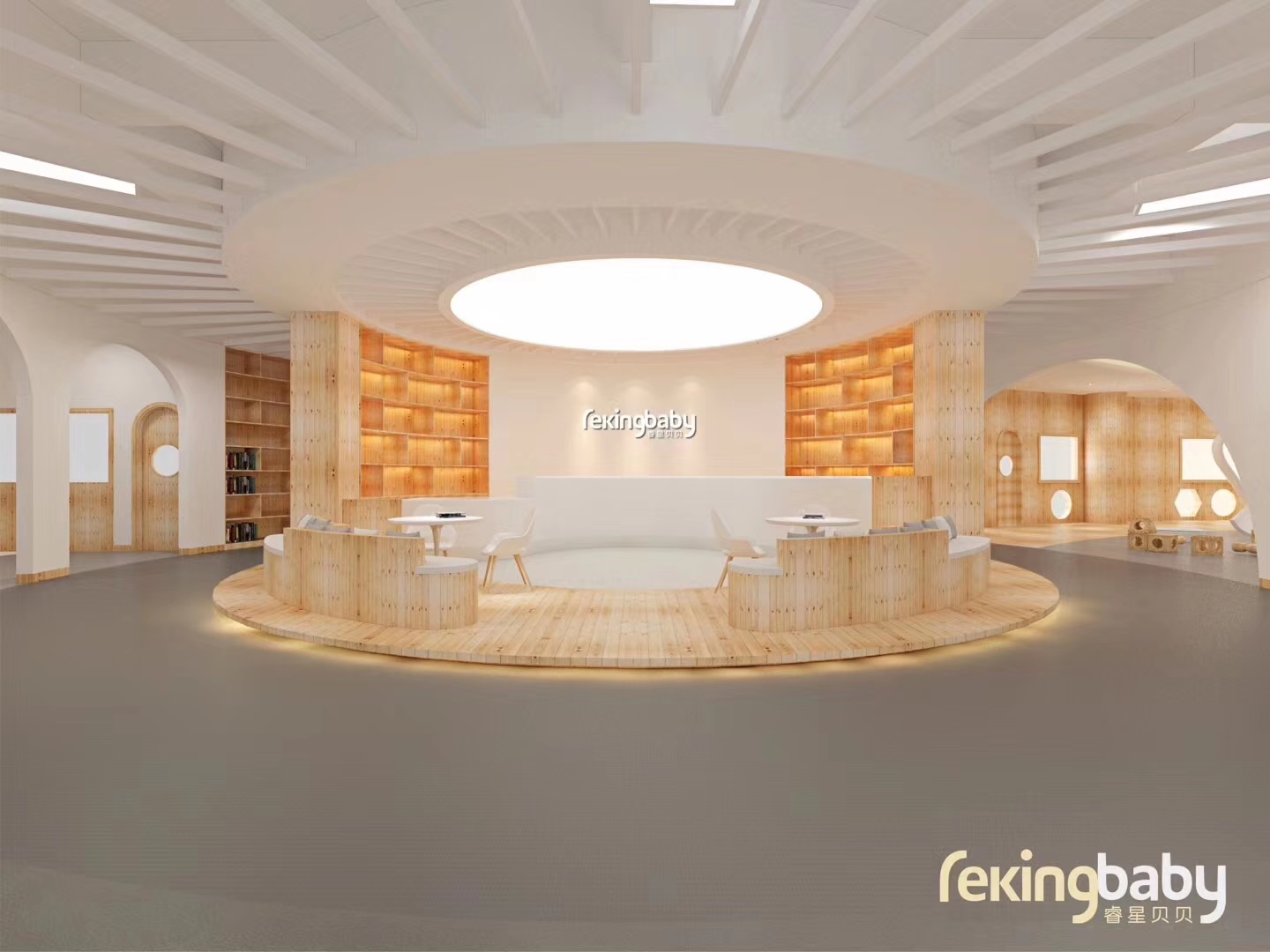
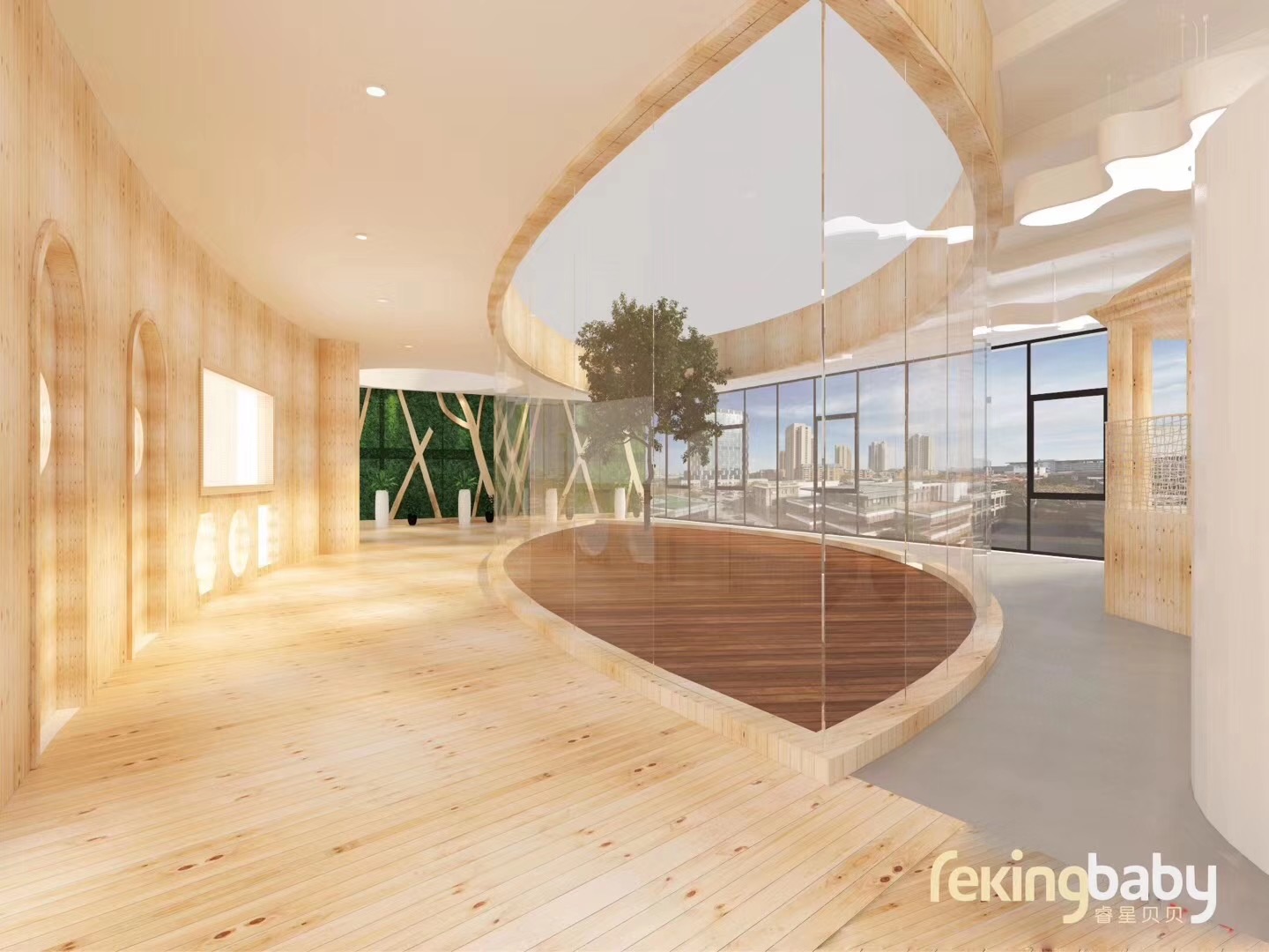
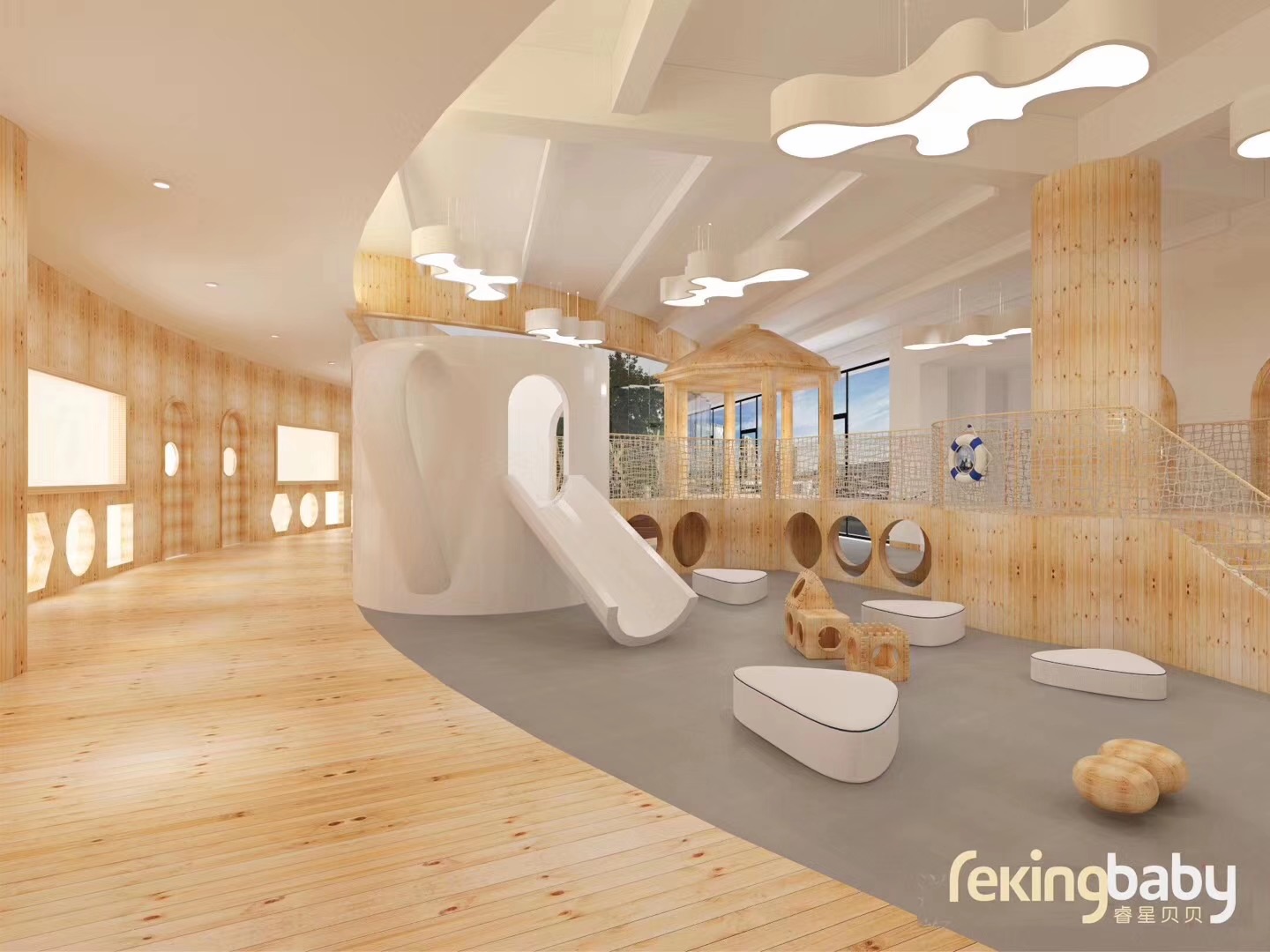
Physical learning-space design and a branded upgrade of REKING BABY's early-education program, creating an environment that is both playful and professional.
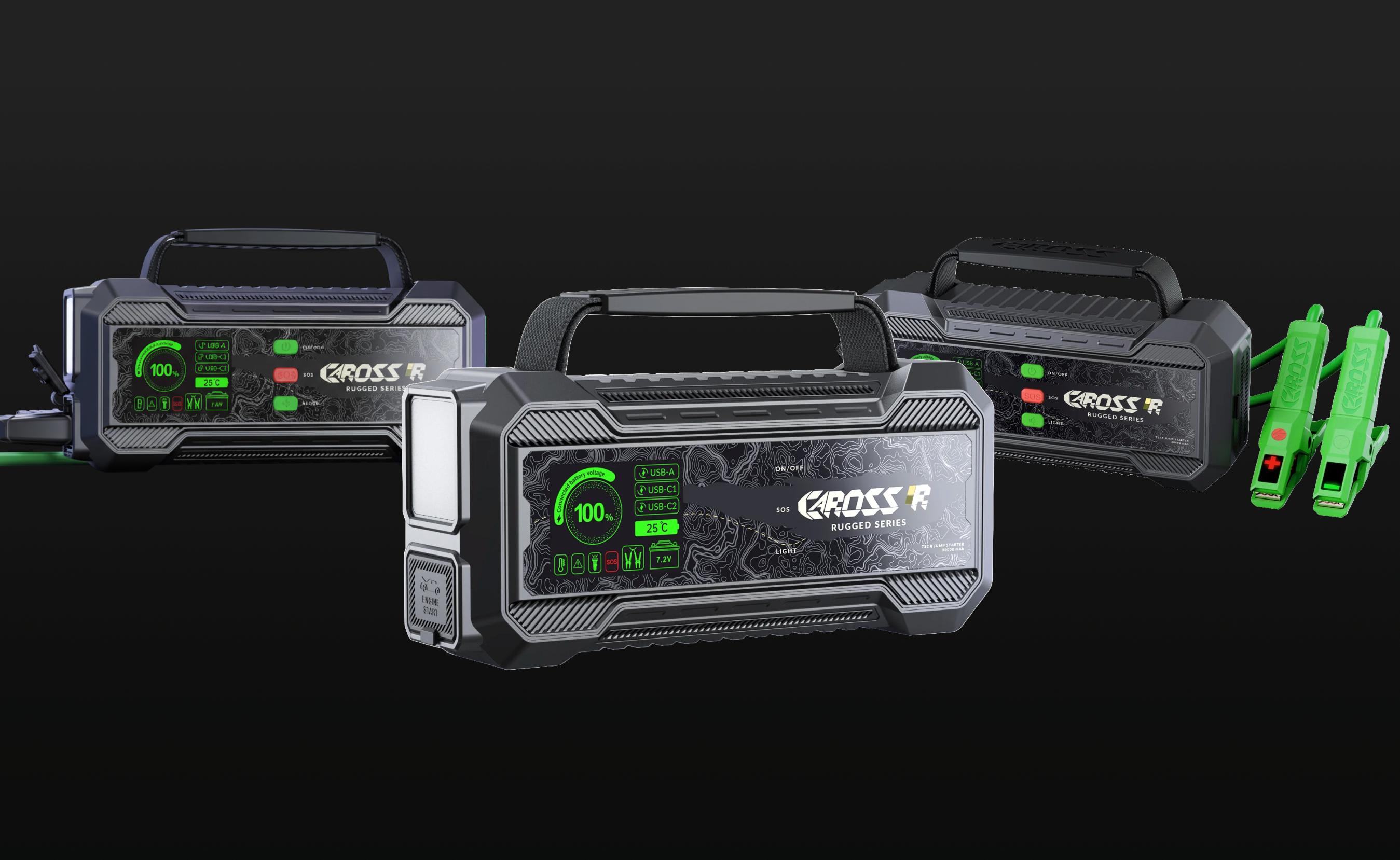
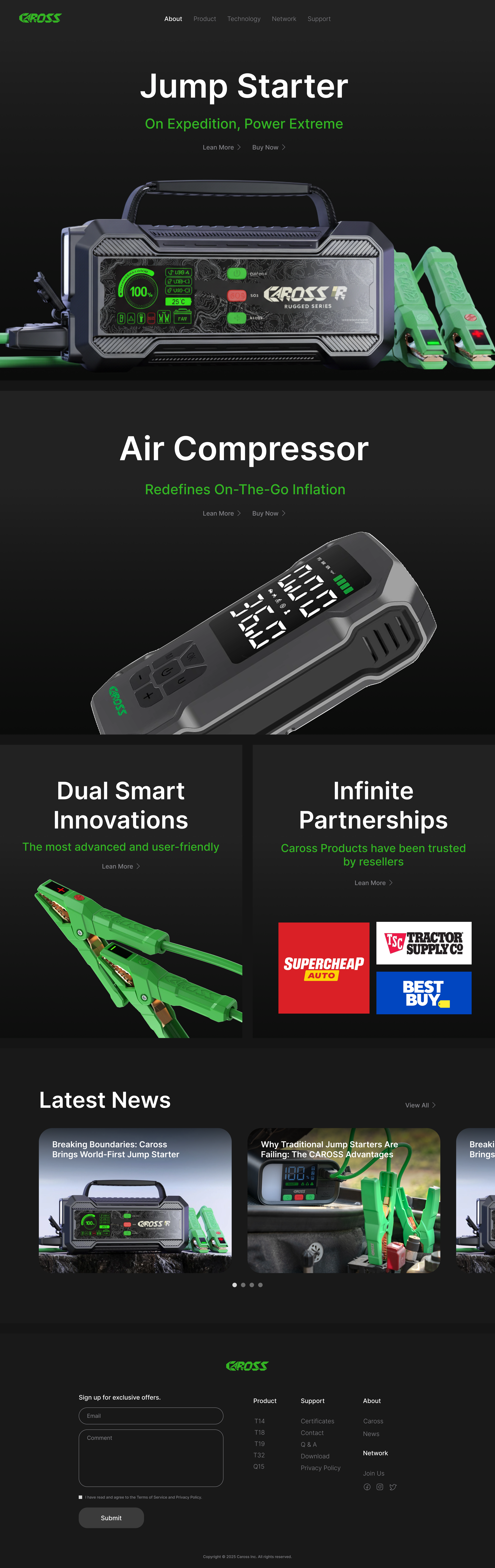
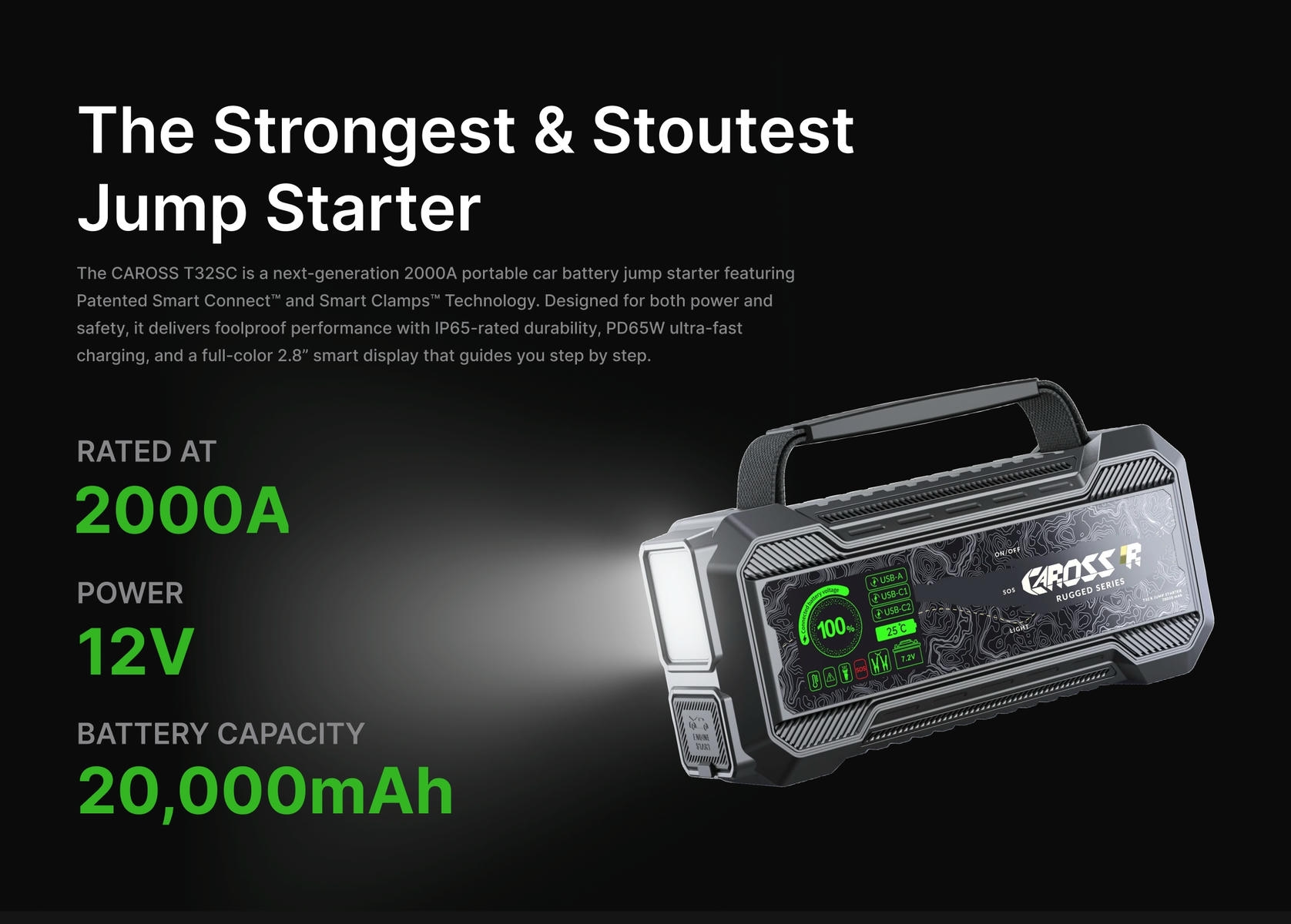
A Shopify store for Caross, a car jump starter with an exclusive US patent (Smart Connect™). We traded the old auto-parts look for clean consumer-tech minimalism, turning a patent that "never shorts, however you clamp it" into safety any family understands at a glance — and won over first-time and family buyers.