Teaspa
Spa chain branding
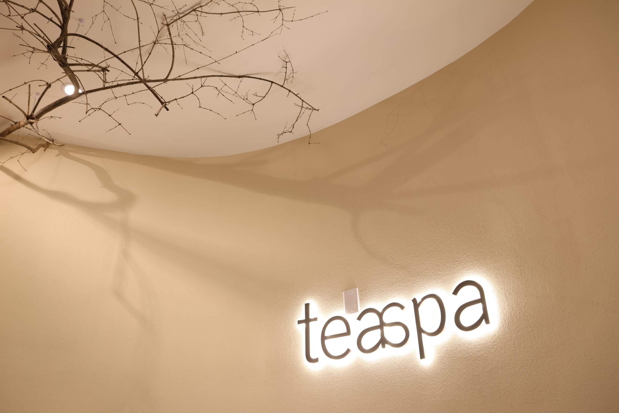
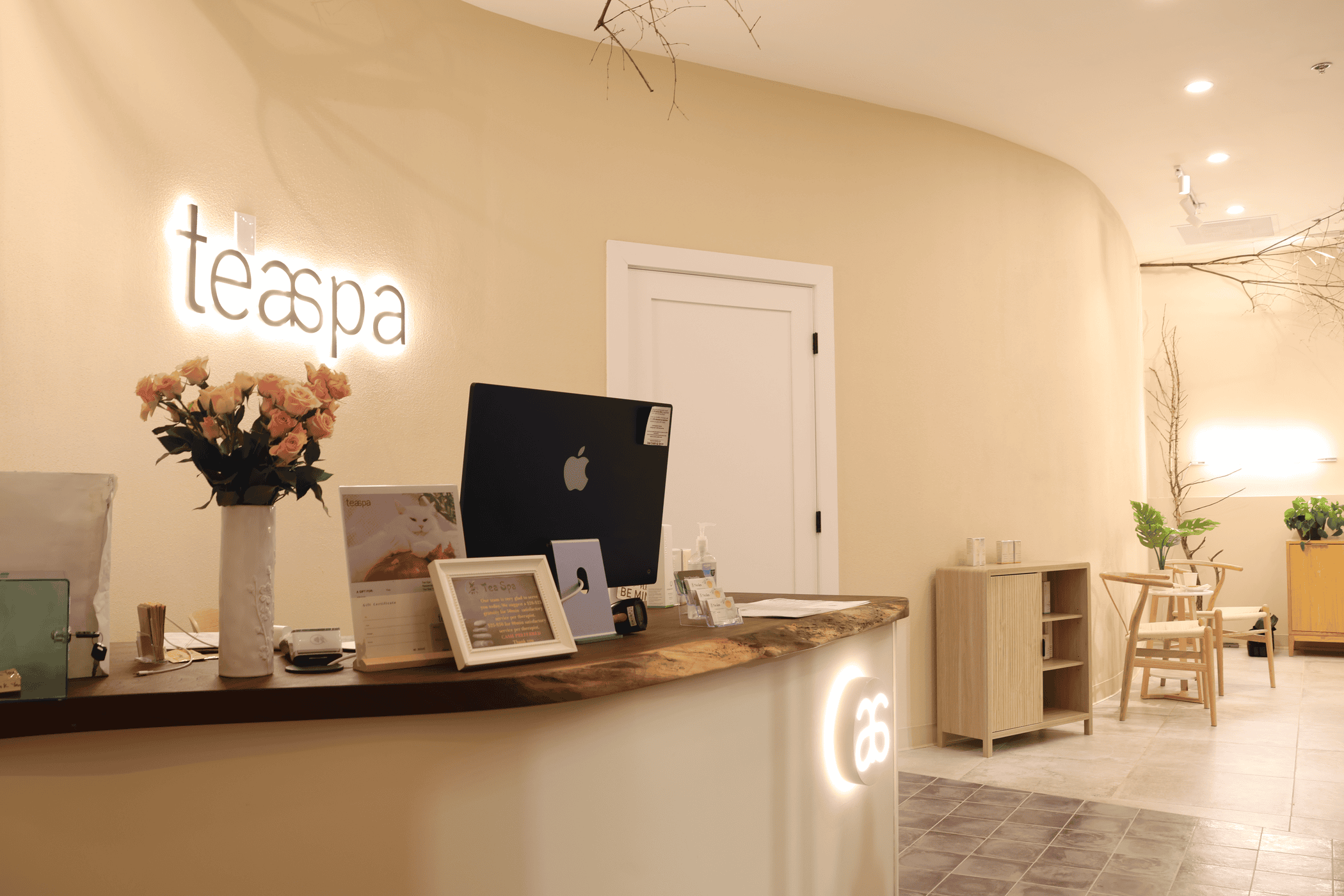
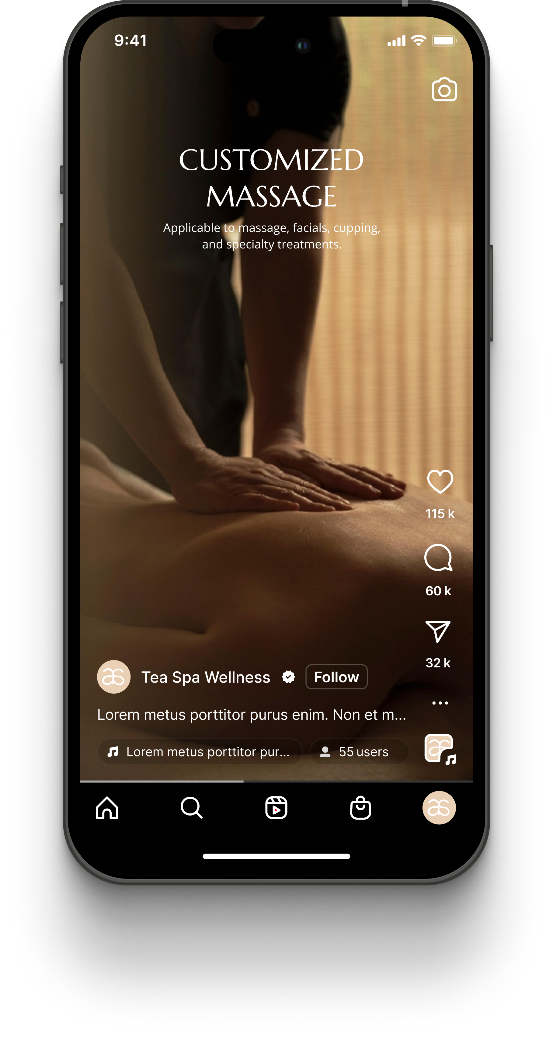
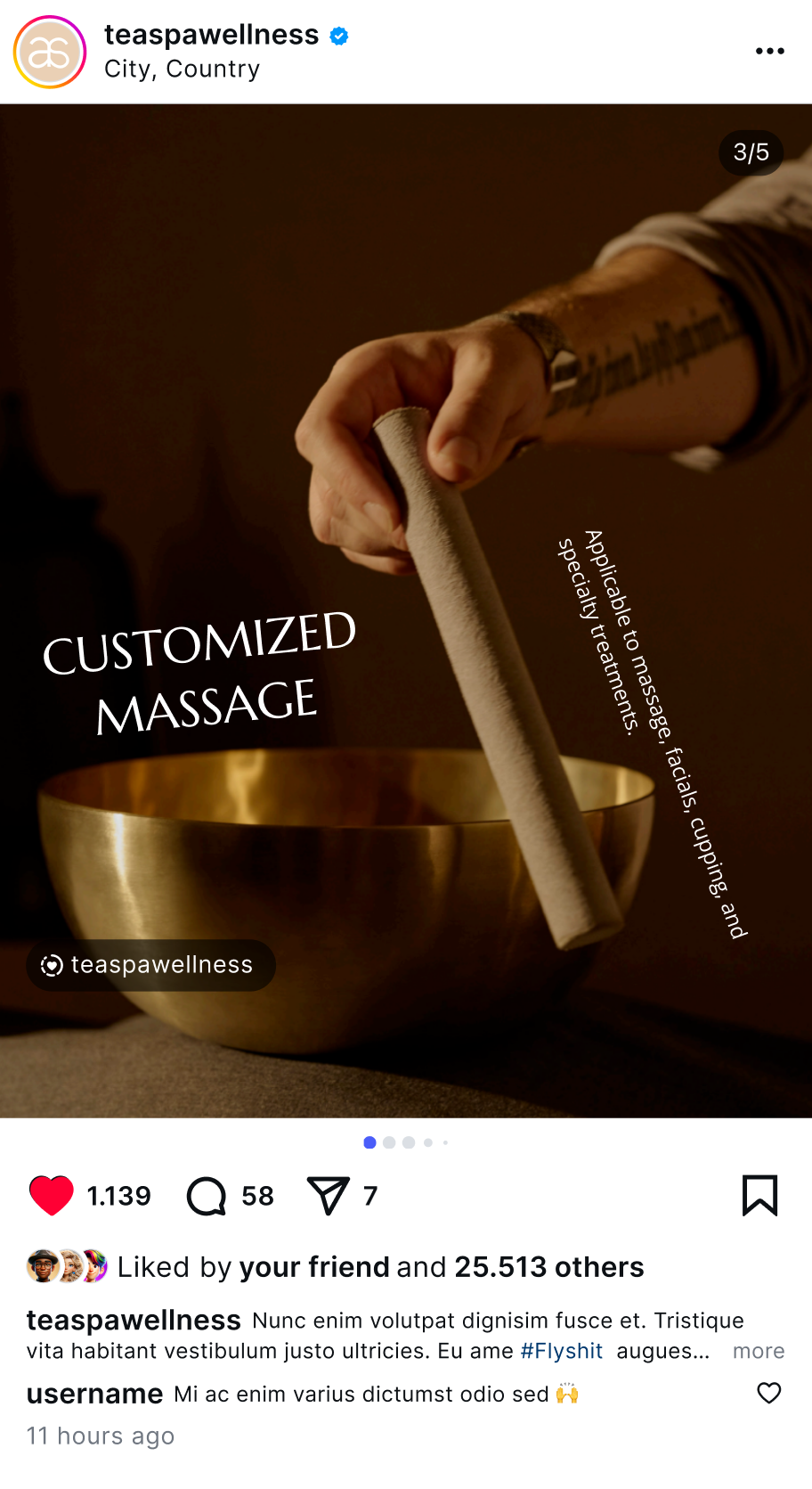
A complete brand identity system — logo, color, typography, packaging and spatial applications — creating a visual language that extends across every medium.
A Chinese-owned massage chain
needed a language of its own
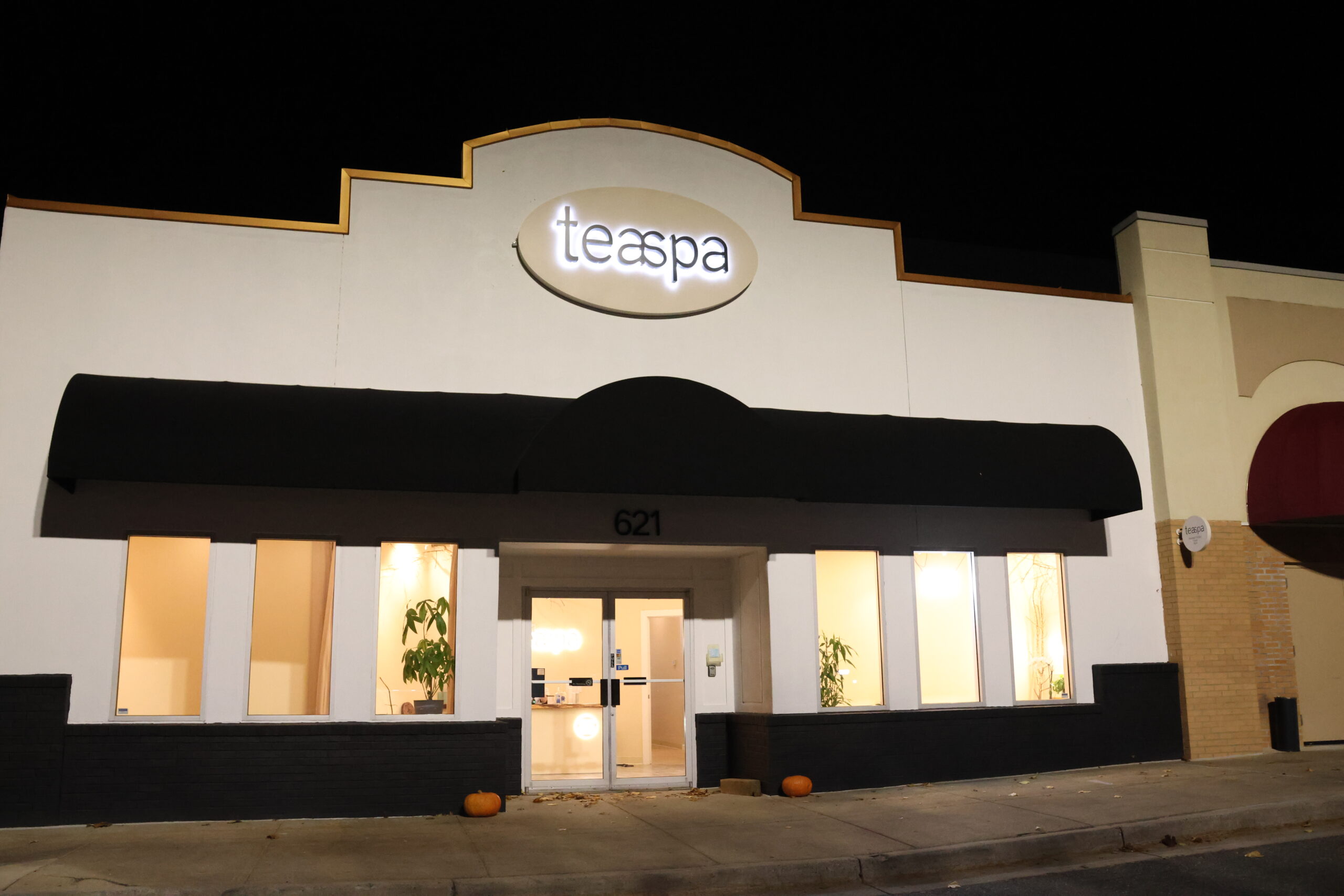
Teaspa has a strong base in Maryland, with locations in Rockville, Bethesda, Gaithersburg, Wheaton and Frederick. That growth was also the problem: at multi-location scale, a loose visual system and word-of-mouth alone could no longer support further expansion.
Without systematic brand guidelines from the start, materials looked different on every channel, making it hard to build consistent recognition.
Pairing the calm of tea
with the healing of a spa
One emotionally consistent brand language connects the online and offline funnel. Whether guests find the website on Google or walk into any location, they immediately feel the same premium, safe sense of relaxation — design that actually drives business.
The rebrand was, at its core, a top-down rethink of the guest experience.
Process
Three stagesWe began with in-depth interviews with the founding team to map the brand's core values, target guests and competitive landscape. That work produced the brand idea of "precise negative space" — a strategic anchor for every visual decision that followed.
We distilled forms from traditional tea ware, calligraphy and Eastern architecture. After three rounds of refinement, we landed on a clean logo system built around a simplified leaf form.
With the logo set, we built complete brand guidelines covering color, typography, graphic language, supporting elements and misuse rules. In-store spatial guidance and everyday packaging rolled out at the same time.
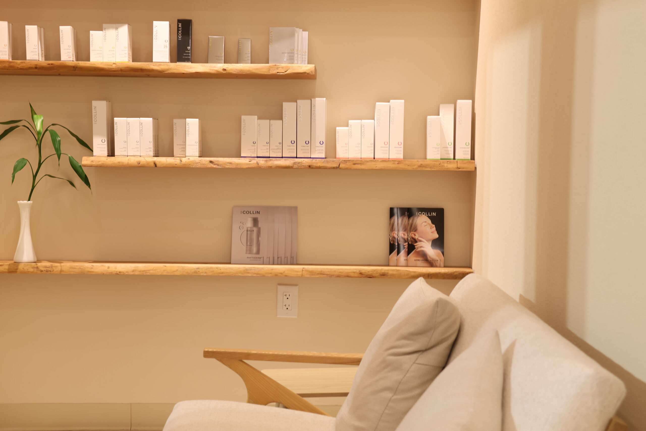
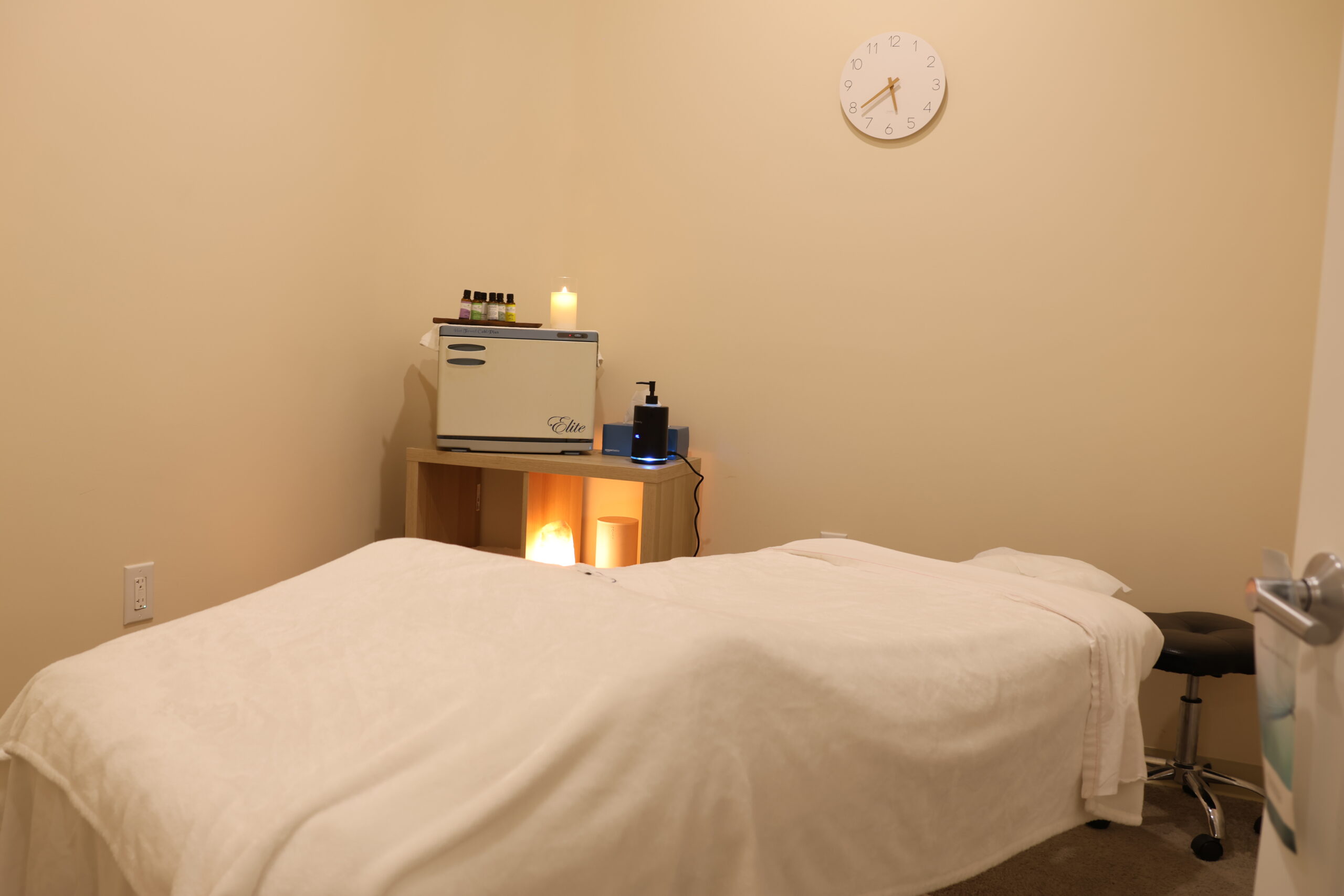
By the numbers
The value of design
After the rebrand, Teaspa opened three more locations, and both repeat visits and organic social sharing exceeded expectations.
"The LGX team turned what we wanted to say but couldn't put into words into visuals. When we saw the final design, it was exactly the feeling we wanted."
— Founder, Teaspa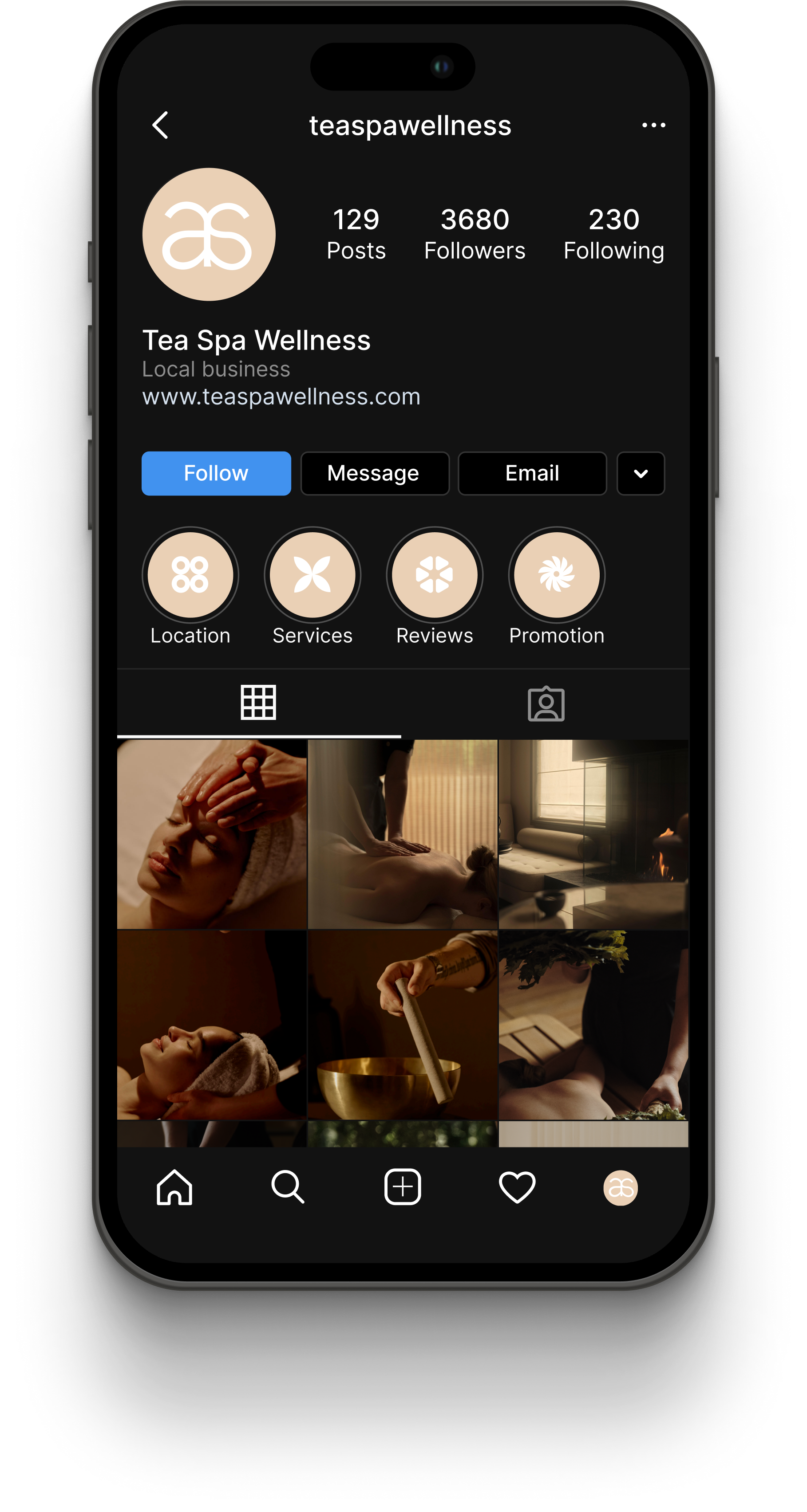
02 · Website design
Fantasy of Taste
French patisserie website