
TOPEDIT & TOPYIELD
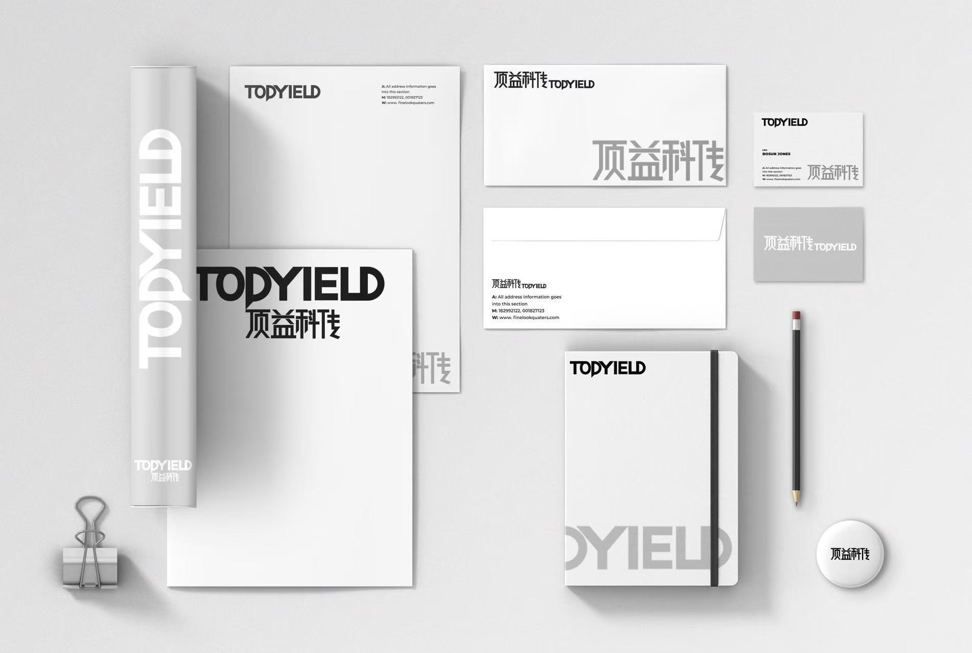
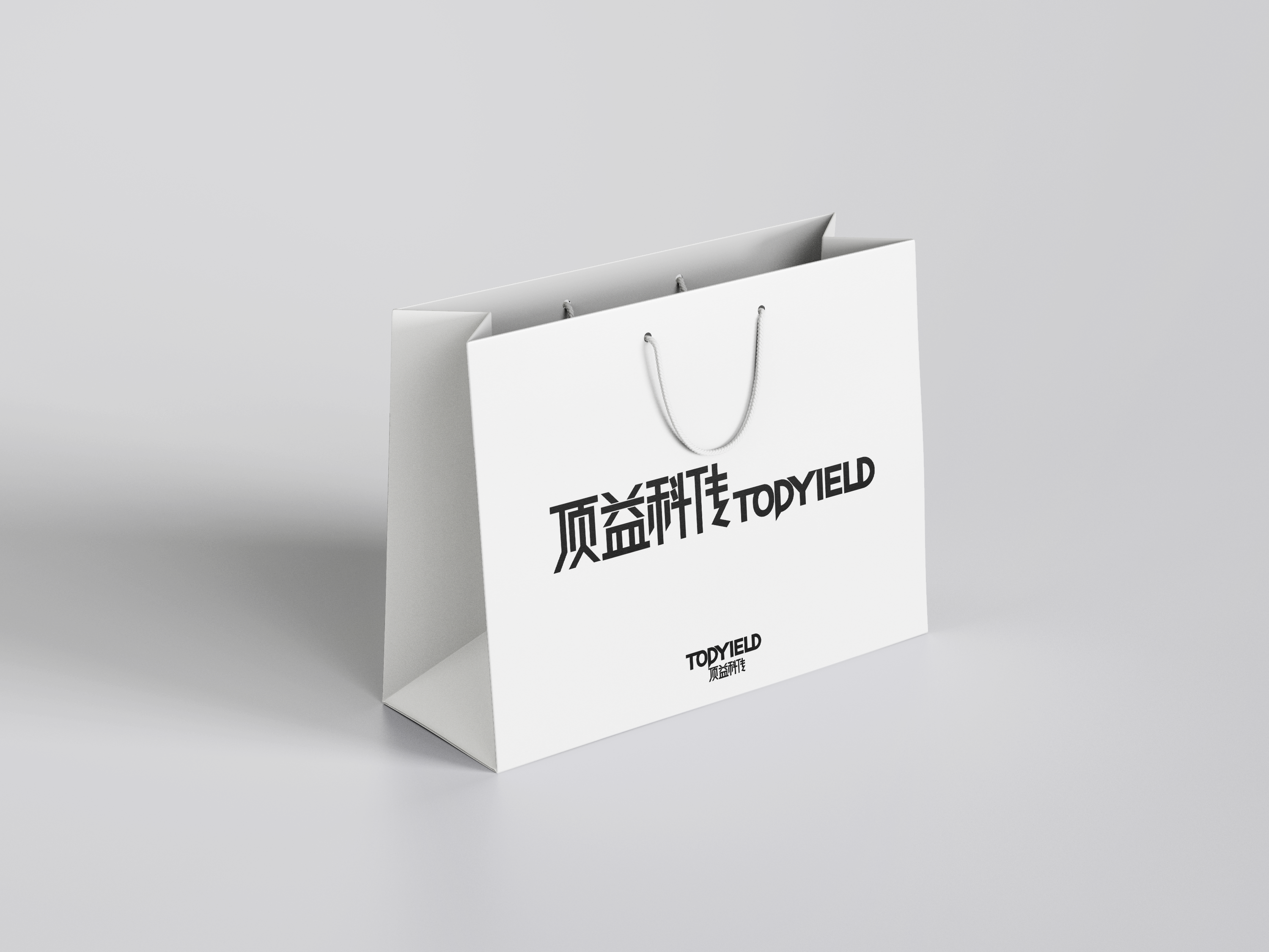
Parent and sub-brand identity
Strong academic credibility for a leading SCI manuscript editing company and its journal sub-brand — no decoration, just the rigor of an international journal to earn trust in academia.
Ivy League talent
deserves more than a cheap storefront
Academia is a demanding market. Researchers who hand over a hard-won SCI manuscript for editing or translation value rigor and authority above all.
TopEdit's native-English editors are outstanding — over 85% hold master's or PhD degrees from schools such as Harvard and Cornell. But if the brand and materials look like a cheap print shop, clients won't trust you with their work. Real strength needs a presence to match.
Making elite credentials visible
and earning researchers' trust
For the parent brand TopEdit and its sub-brand TopYield, which serves Chinese scientific journals, our strategy was extremely restrained.
We removed the old promotional styling and set layout standards modeled on top international journals. An identity full of academic order — rigorous almost to a fault — puts researchers from non-English-speaking countries at ease and turns the team's credentials into visible trust.
From design to delivery
Three core stagesTopEdit serves individual scholars and needs warmth and trust; TopYield helps Chinese journals go international and needs B2B authority. Subtle differences in color weight and type hierarchy give each brand its own voice while making the family resemblance obvious.
Reports are what an editing company delivers most. We focused on long-form readability and information hierarchy, using grids modeled on top academic journals so every deliverable feels rigorous and professional.
Because TopYield sells to journal editorial offices, we created a suite of high-end pitch decks and brand brochures that give the team unquestionable visual authority in bids and presentations.

Professional credibility raised
the bar for competitors
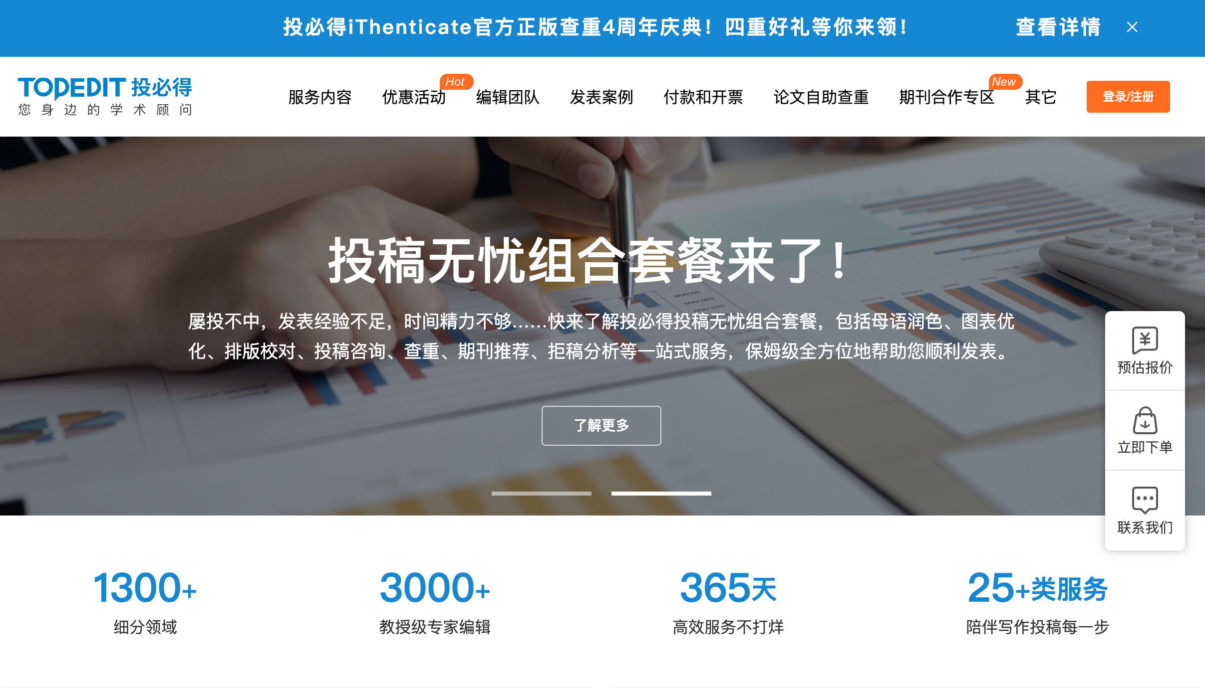
The new identity closed the gap between the team's real expertise and how it was perceived. With individual scholars and in negotiations with major journals alike, it now holds the professional high ground.
"Most of our team are scholars from Harvard and Cornell with deep research backgrounds, but our old brand never reflected that. LGX's rebrand perfectly visualizes our academic rigor and international outlook. Whether we're sending an editing report to a scholar or TopYield is pitching a major journal, this identity opens doors."
— Founder, TopEdit & TopYield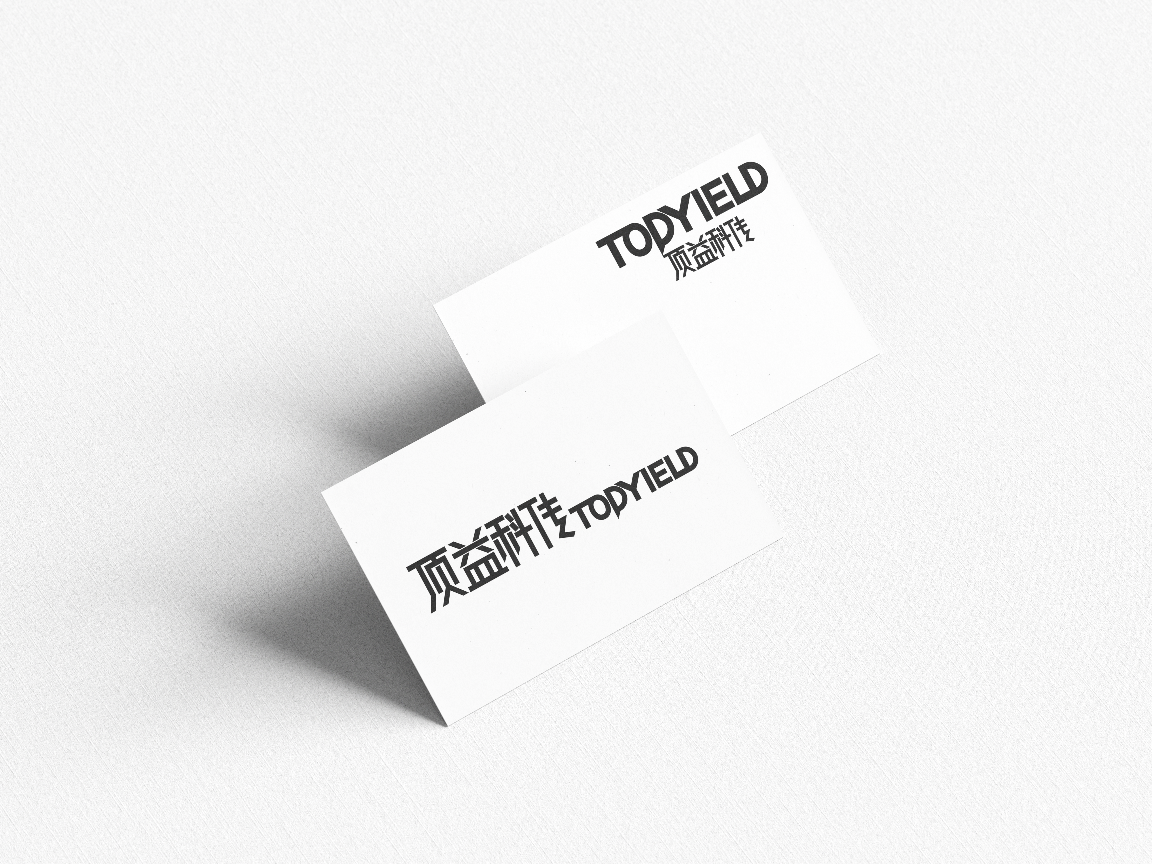
12 · Spatial design & full-service branding
REKING BABY
Premium early-education space branding