
AMATA
Meditation center identity refresh
A visual refresh for a Maryland meditation center, using a reductive design language to express letting go — and lowering the barrier for newcomers.
Mysterious symbols
had become a barrier
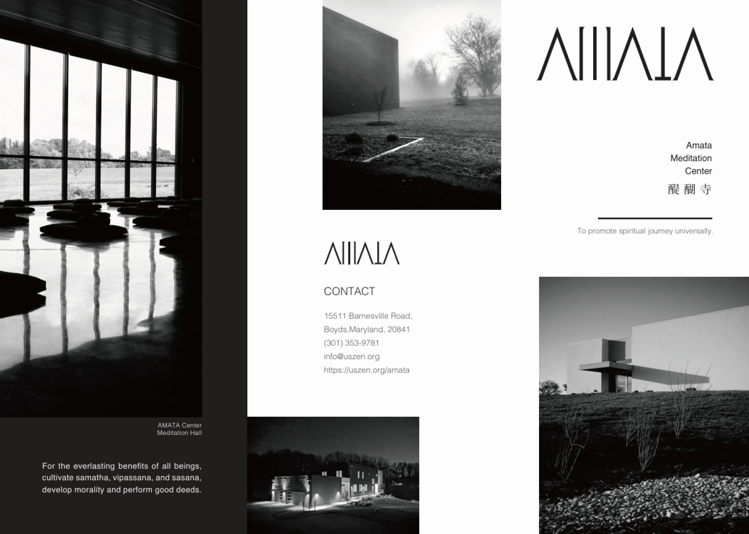
Meditation can sound mysterious, even carry a religious distance that keeps people away. AMATA's old visuals were too traditional and too busy.
People come looking for a place to breathe. Complex symbols and heavy colors only added to their stress, and many never walked through the door.
A complete declutter
white space that makes stillness visible
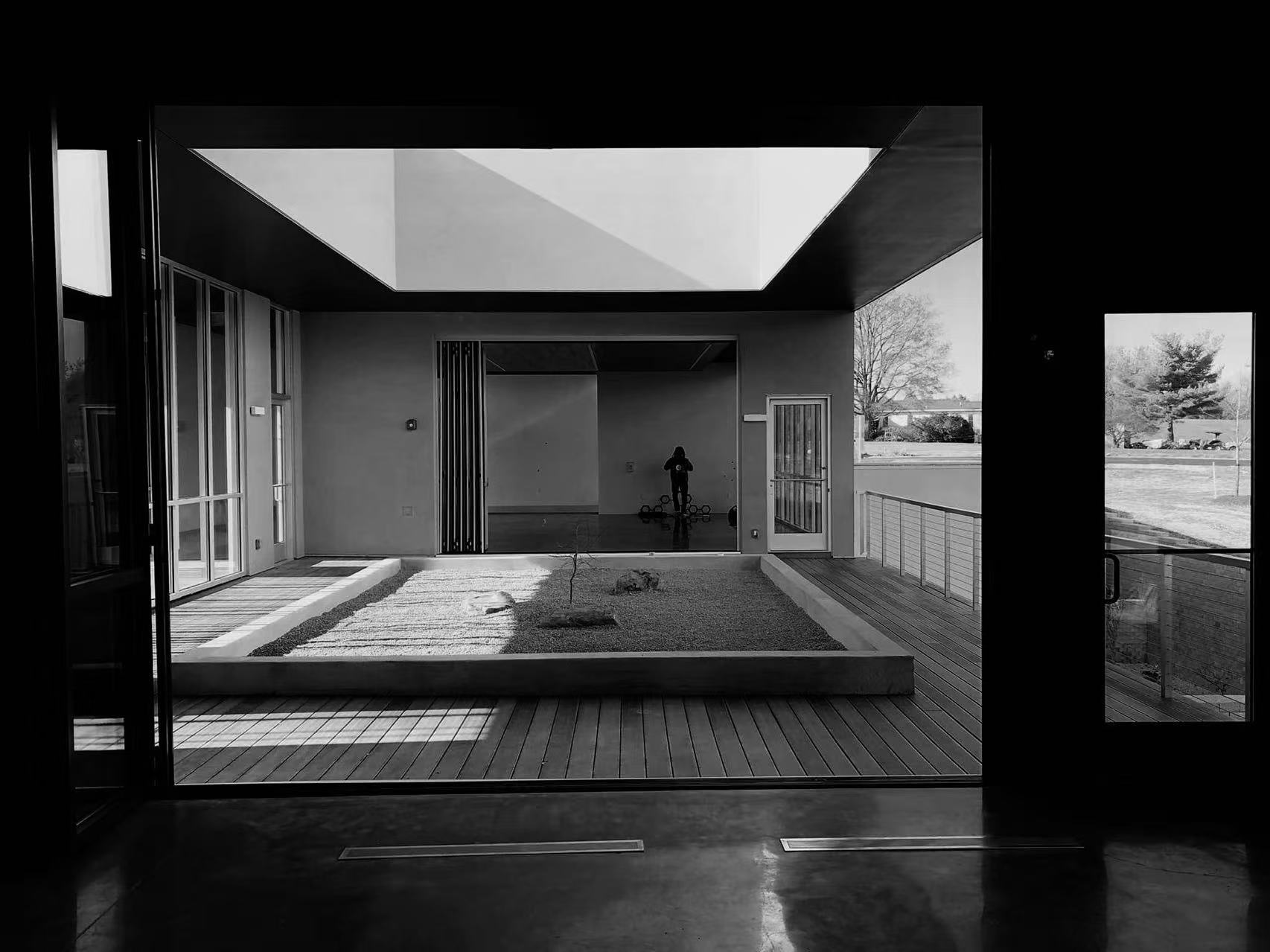
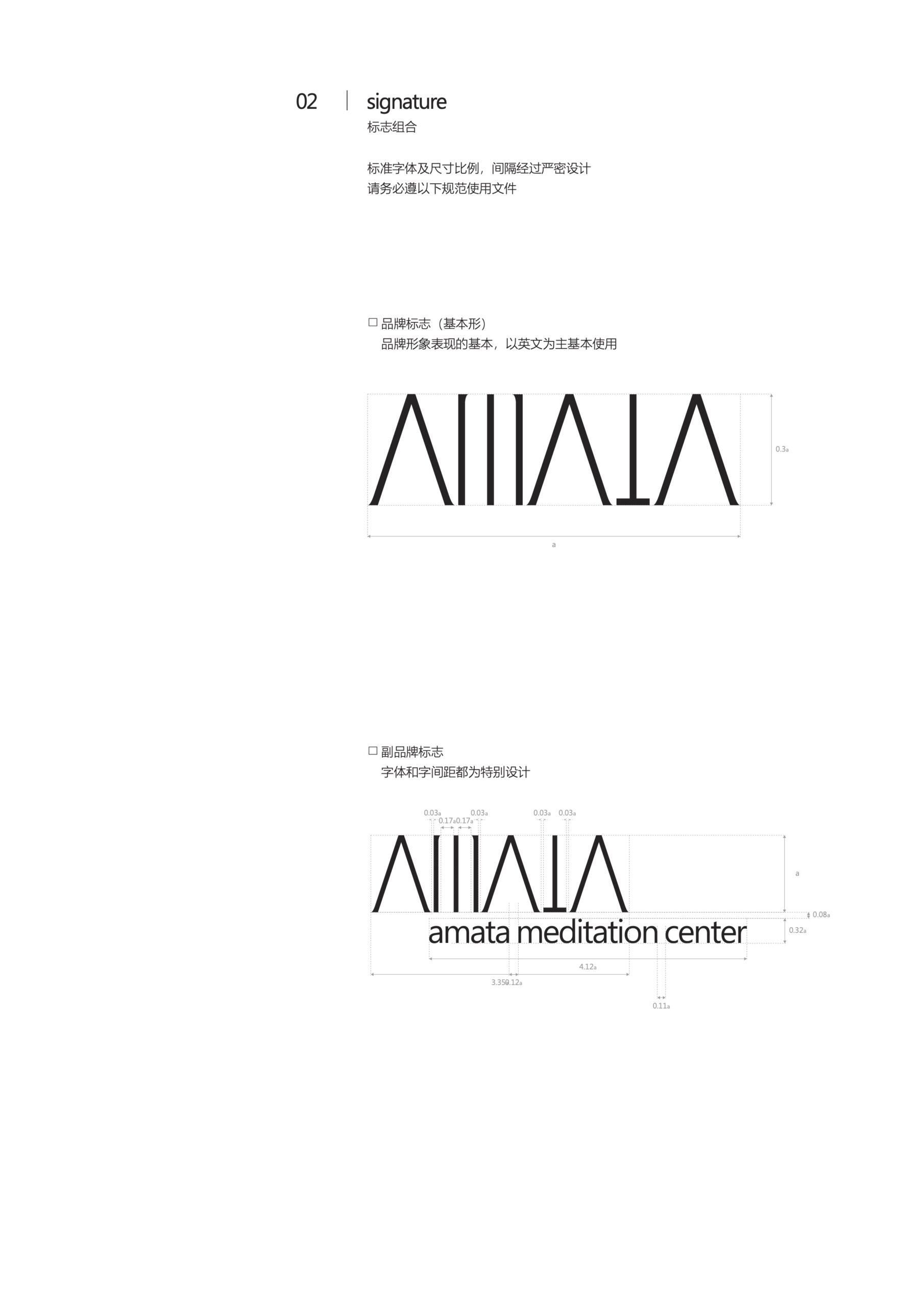
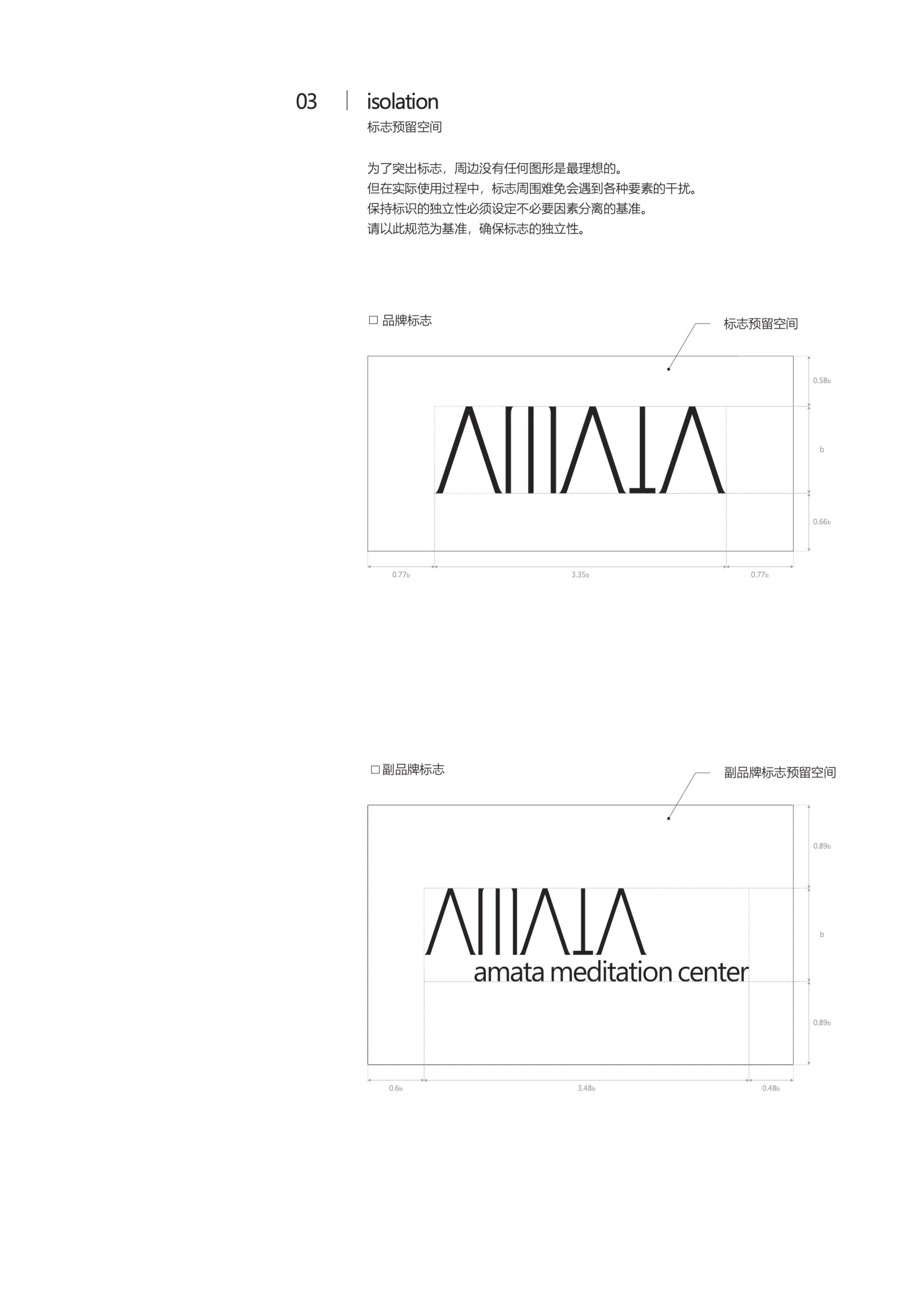
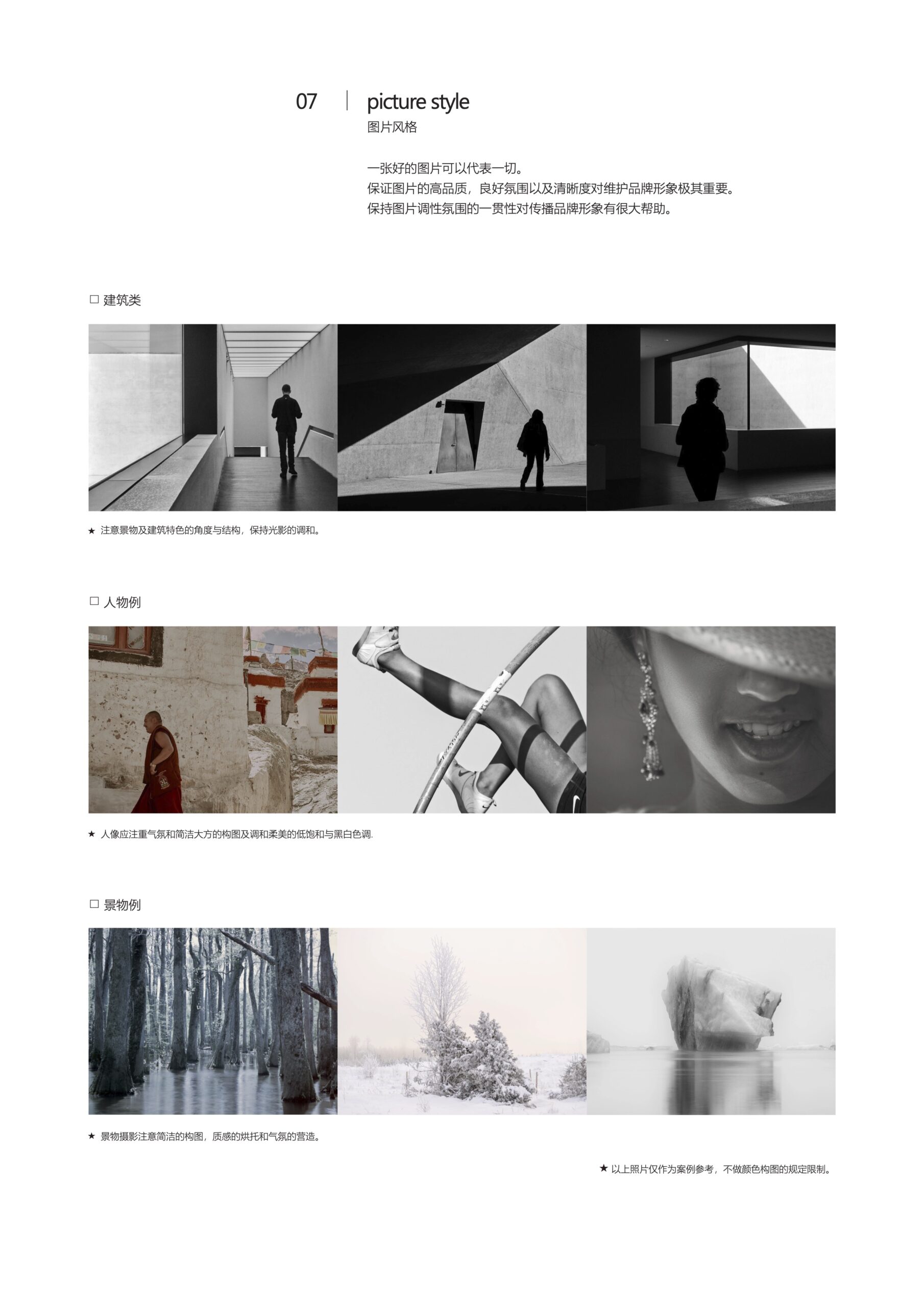
The spirit of meditation is letting go and returning to essentials. The rebrand did exactly that: we removed every rigid religious symbol and built the identity on white space, light and shadow, and natural textures.
That restrained, almost empty design language makes stillness tangible, eases newcomers' doubts and makes signing up for an intro class feel natural.
From design to delivery
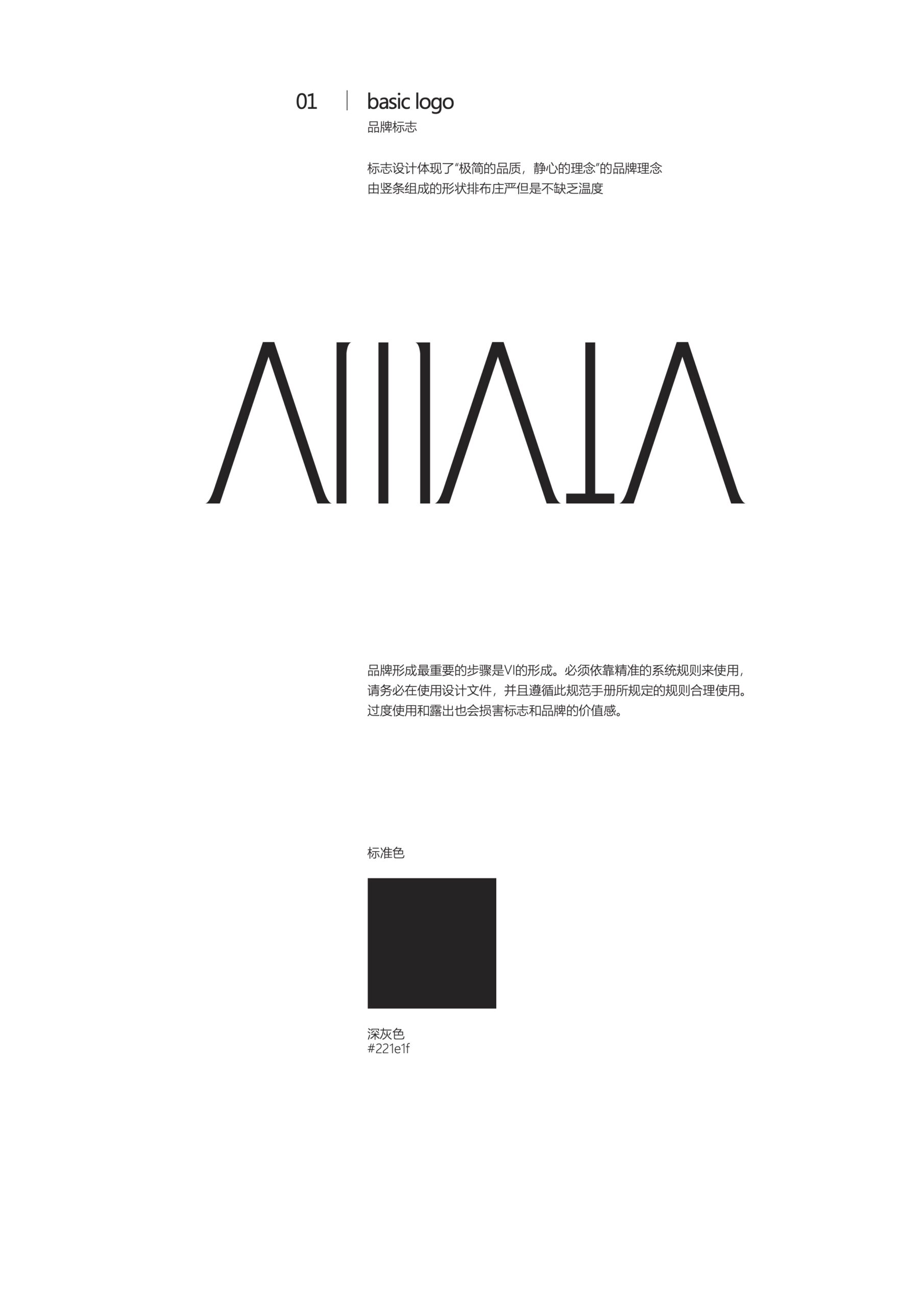
Three core stagesBefore designing, we attended several sessions and found that what people need most is to clear their minds. We set a strategy of subtraction: no literal traditional Buddhist imagery, with natural light and shadow at the core.
Minimal geometric lines suggest breath and flow, paired with a restrained, low-saturation palette. The system feels effortless and calms the mind at a glance.
We extended the visual language to wayfinding, meditation cushion labels and the online booking interface, so the feeling is continuous from the website to the moment people sit down at the center.
Lowering the barrier opened
a broader audience
Leaving the complexity behind opened the center to a much wider audience. People who once hesitated now come — the clear new visuals attract young professionals and busy workers from nearby communities.
"People used to think of us as mysterious, even a little intimidating. Leo's team took that barrier down completely. This clear design truly understands Zen — no clutter, just what is essential. Now people feel relaxed the moment they see our sign."
— Founder, AMATA Meditation Center

09 · Digital marketing & brand design
YUEHE Real Estate
Brand upgrade for a top brokerage